4 可视化与建模
4.1 ggplot2基础语法
4.1.1 ggplot2概述
ggplot是最流行的R可视化包,基于图层化语图形是一层一层的图层叠加而成,先进的绘图理念、优雅的语法代码、美观大方的生成图形,让ggplot2 迅速走红。
ggplot2 绘图语法
选取整洁数据将其映射为几何对象(如点、线等),几何对象具有美学特征(如坐标轴、颜色等) ,若需要则对数据做统计变换,调整标度,将结果投影到坐标系,再根据喜好选择主题。
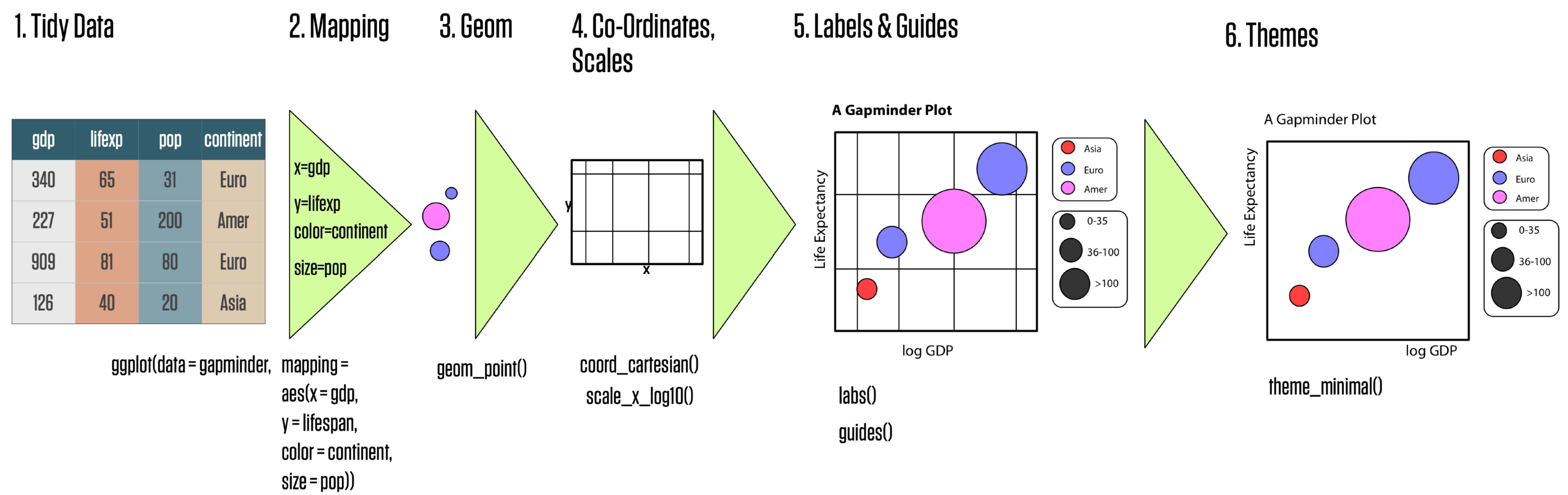
图4.1: ggplot2 绘图流程
ggplot 的语法包括10 个部件:
- 数据(data)
- 映射(mapping)
- 几何对象(grom)
- 标度(scale)
- 统计变换(stats)
- 坐标系(coord)
- 位置调整(position adjustments)
- 分面(facet)
- 主题(theme)
- 输出(output)
10 个部件中,前3 个是必须的,其他部件ggplot2 会自动帮你做好它认为’’ 最优’’ 的配置,当然也都可以手动定制。
4.1.2 数据、映射、几何对象
数据(data)
数据:用于绘图的数据,需要是整洁的数据框。本节用ggplot2 自带数据集演示。
## # A tibble: 4 × 11
##   manufacturer model displ  year   cyl trans      drv     cty   hwy fl    class
##   <chr>        <chr> <dbl> <int> <int> <chr>      <chr> <int> <int> <chr> <chr>
## 1 audi         a4      1.8  1999     4 auto(l5)   f        18    29 p     compa…
## 2 audi         a4      1.8  1999     4 manual(m5) f        21    29 p     compa…
## 3 audi         a4      2    2008     4 manual(m6) f        20    31 p     compa…
## 4 audi         a4      2    2008     4 auto(av)   f        21    30 p     compa…
用ggplot() 创建一个坐标系统,先只提供数据,此时只是创建了一个空的图形:
映射(mapping)
函数aes() 是ggplot2 中的映射函数, 所谓映射就是将数据集中的变量数据映射(关联) 到相应的图形属性,也称为“美学映射”或“美学”。
最常用的映射(美学) 有:
- x:x轴
- y:y轴
- color:颜色
- fill:填充
- size:大小
- shape:形状
- alpha:透明度
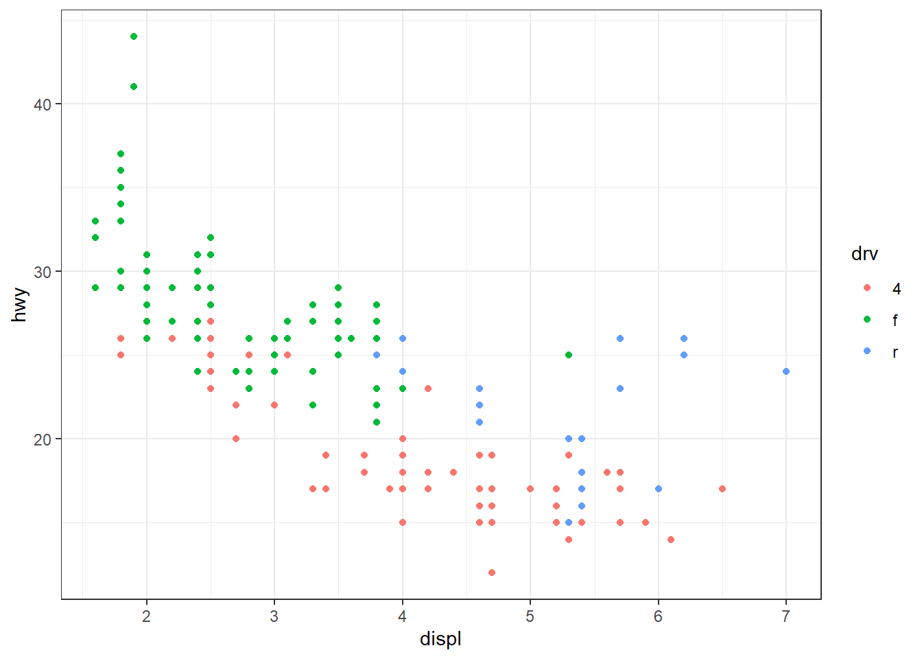
最需要的美学是x 和y, 分别映射到变量displ 和hwy, 再将美学color 映射到drv,此时图形就有 了坐标轴和网格线,color 美学在绘制几何对象前还体现不出来:
注意:映射不是直接为出现在图形中的颜色、外形、线型等设定特定值,而是建立数据中的变量 与可见的图形元素之间的联系,经常将图形的美学color, size 等映射到数据集的分类变量,以实现 不同分组用不同的美学来区分。所以,若要为美学指定特定值,比如color = “red”, 是不能放在映射aes() 中的。
几何对象(Geometric)
每个图形都是采用不同的视觉对象来表达数据,称为是‘‘几何对象’’。 通常用不同类型的“几何对象” 从不同角度来表达数据,如散点图、平滑曲线、线形图、条形图、 箱线图等。 ggplot2 提供了50 余种“几何对象”,均以geom_xxxx() 的方式命名,常用的有:
- geom_point():散点图
- geom_line():折线图
- geom_smooth():光滑(拟合)曲线
- geom_bar()/geom_col():条形图
- geom_histogram():直方图
- geom_density():概率密度图
- geom_boxplot():箱线图
- geom_abline():参考直线
要绘制几何对象,就是添加图层即可。
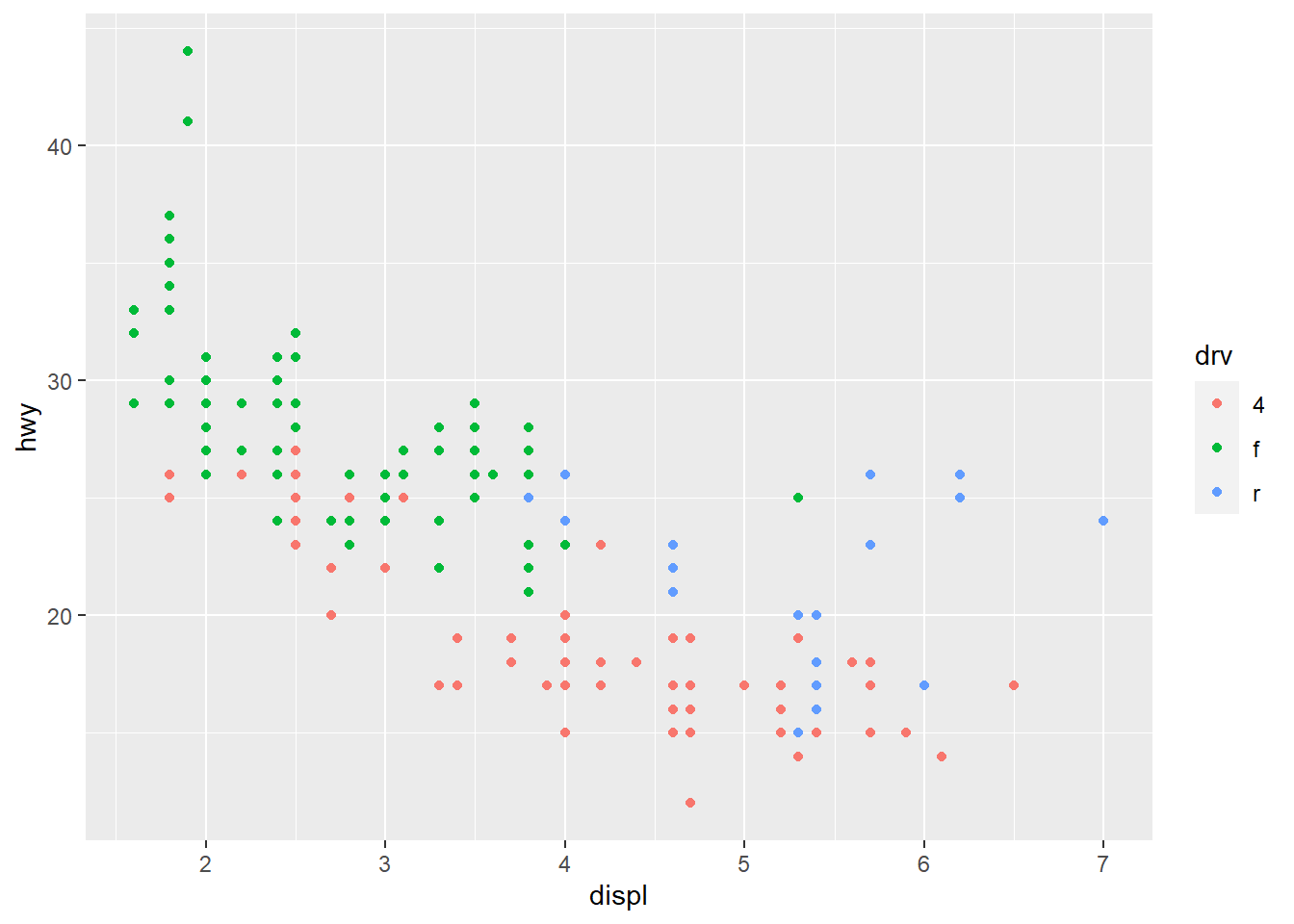
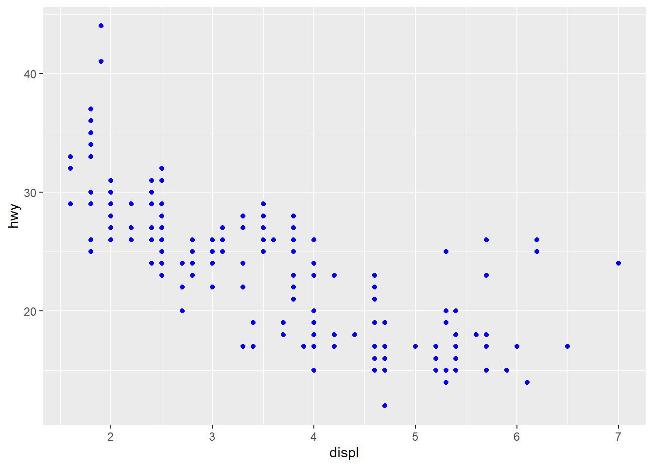
不同的几何对象支持的美学会有些不同,美学映射也可以放在几何对象中,上面代码可改写为:
前面提到,为图形美学设置特定值也是可以的,但不能放在映射aes() 中:
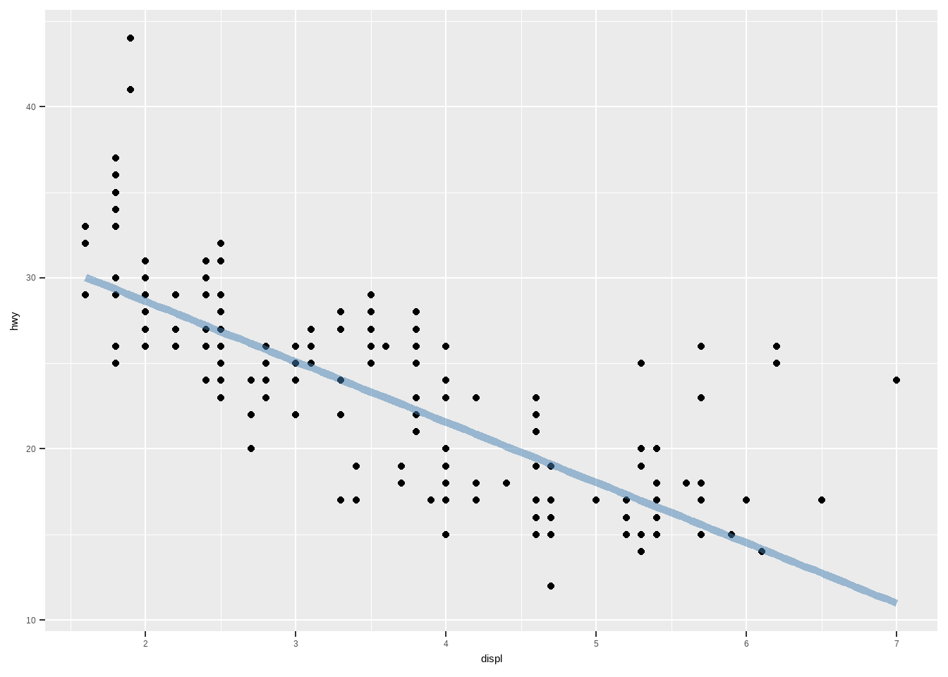
图层是可以依次叠加的,再添加一个几何对象:光滑曲线,然后来区分一下如下两个图形:
## `geom_smooth()` using method = 'loess' and formula = 'y ~ x'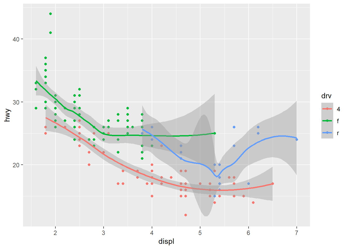
## `geom_smooth()` using method = 'loess' and formula = 'y ~ x'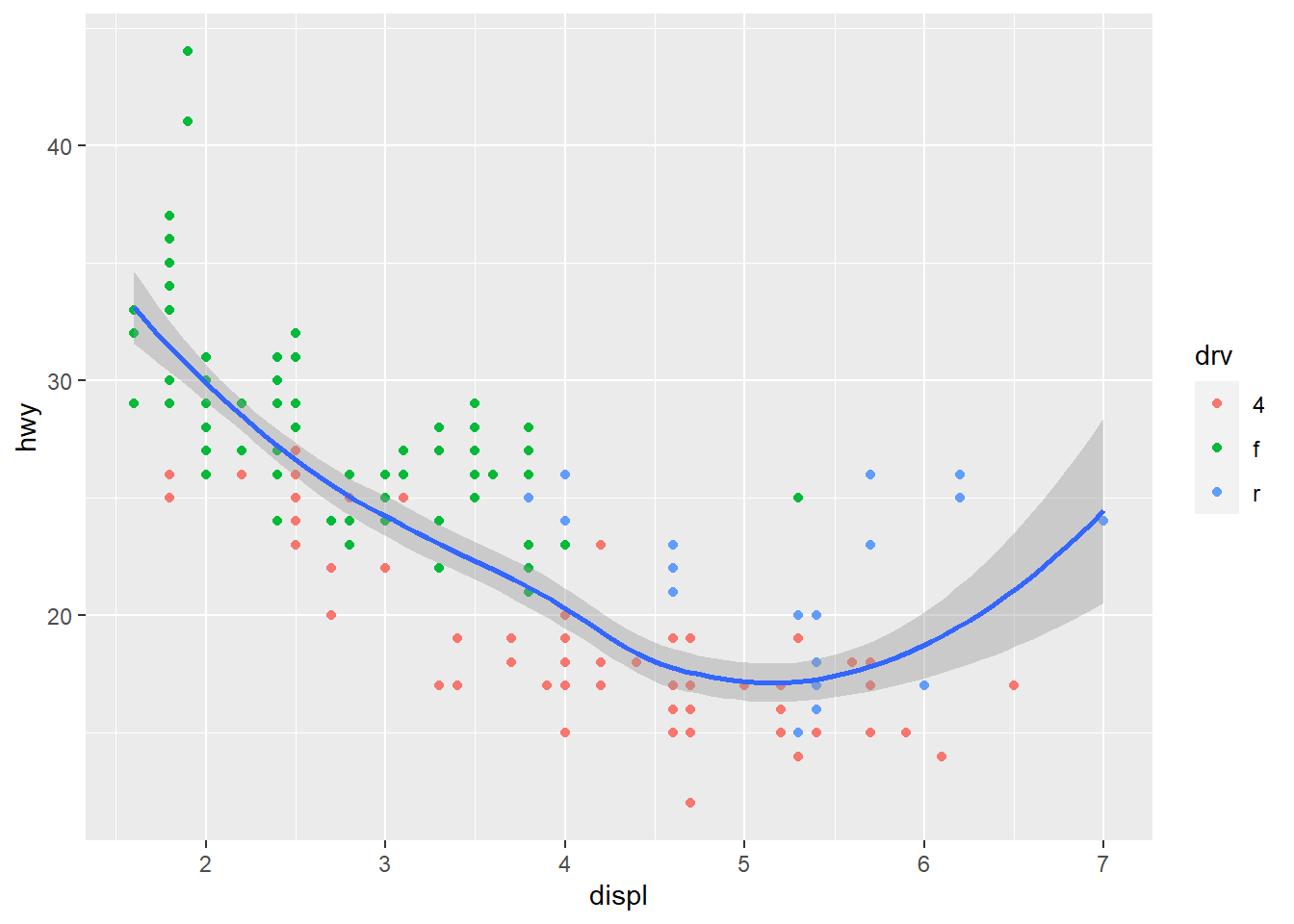
为什么会出现这种不同呢?这就涉及ggplot2“全局”与“局部”的约定:
- ggplot() 中的数据和映射,是全局的,可供所有几何对象共用;
- 而位于“几何对象”中的数据和映射,是局部的,只供该几何对象使用;
- “几何对象”优先使用局部的,局部没有则用全局的。
4.1.3 标度
通常ggplot2 会自动根据输入变量选择最优的坐标刻度方案,若要手动设置或调整,就需要用到标度函数:scale_
标度函数控制几何对象中的标度映射:不只是x, y 轴,还有color, fill, shape, size 产生的图例。它们是数据中的连续或分类变量的可视化表示,这需要关联到标度,所以要用到映射。
常用的标度函数有:
- scale_*_continunos():*为x或y
- scale_*_discrete():*为x或y
- scale_x_date()
- scale_x_datetime()
- scale_log10(),scale_sqrt(),scale_*_reverse():*为x或y
- scalse_gradient(),scale_gradient2(),*为color,fill等
scales 包提供了很多现成的设置刻度标签风格的函数。
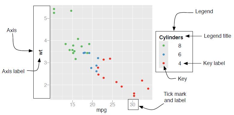
图4.2: 图例与坐标轴的组件
4.1.3.1 修改坐标轴刻度及刻度标签
用scale_*_continuous() 修改连续变量坐标轴的刻度和标签:
- 参数breaks 设置各个刻度的位置
- 参数labels 设置各个刻度对应的标签
ggplot(mpg,aes(displ,hwy))+
  geom_point()+
  scale_y_continuous(breaks = seq(15,40,by=10),
                     labels = c("一五","二五","三五"))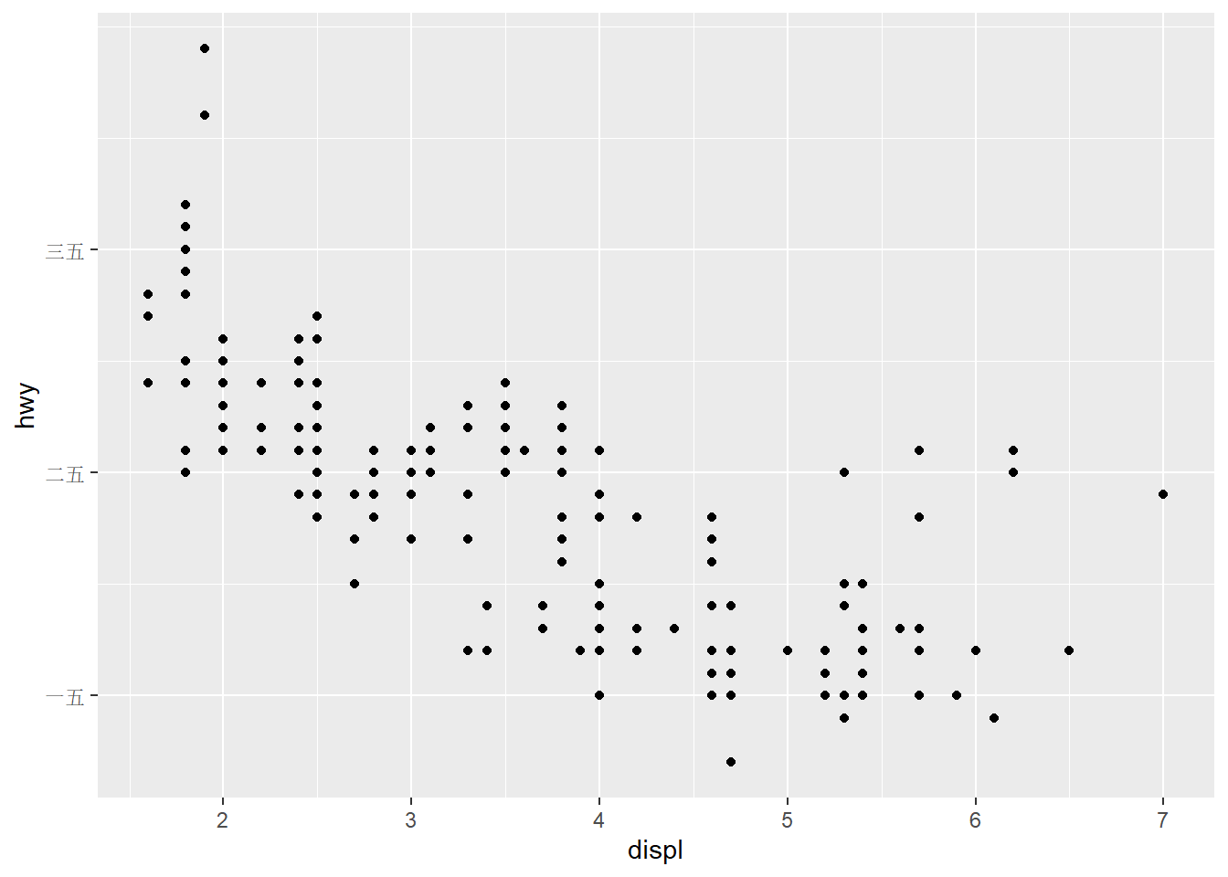
用scale_*_discrete() 修改离散变量坐标轴的标签:
用scale_x_date() 设置日期刻度,参数date_breaks 设置刻度间隔,date_labels 设置标签的日期格式;借助scales包中的函数设置特殊格式,比如百分数(percent)、科学计数法(scientific)、美元格式(dollar) 等。
## # A tibble: 574 × 6
##    date         pce    pop psavert uempmed unemploy
##    <date>     <dbl>  <dbl>   <dbl>   <dbl>    <dbl>
##  1 1967-07-01  507. 198712    12.6     4.5     2944
##  2 1967-08-01  510. 198911    12.6     4.7     2945
##  3 1967-09-01  516. 199113    11.9     4.6     2958
##  4 1967-10-01  512. 199311    12.9     4.9     3143
##  5 1967-11-01  517. 199498    12.8     4.7     3066
##  6 1967-12-01  525. 199657    11.8     4.8     3018
##  7 1968-01-01  531. 199808    11.7     5.1     2878
##  8 1968-02-01  534. 199920    12.3     4.5     3001
##  9 1968-03-01  544. 200056    11.7     4.1     2877
## 10 1968-04-01  544  200208    12.3     4.6     2709
## # ℹ 564 more rowsggplot(tail(economics,45),aes(date,uempmed/100))+
geom_line()+
scale_x_date(date_breaks = "6 months",date_labels = "%b%Y")+
scale_y_continuous(labels = scales::percent)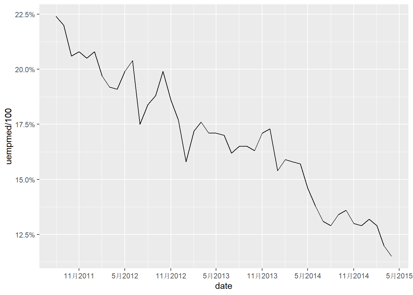
4.1.3.2 修改坐标轴标签、图例名及图例位置
用labs() 函数的参数x, y, 或者函数xlab(), ylab(), 设置x 轴、y 轴标签,前面已使用color美学,则可以在labs() 函数中使用参数color 修改颜色的图例名。
图例位置是在theme 图层通过参数legend.position 设置,可选取值有“none”,“left”,“right”, “bottom”, “top”。
ggplot(mpg,aes(displ,hwy))+
  geom_point(aes(color=drv))+
  labs(x="引擎大小(L)",y="高速燃油率(mpg)",color="驱动类型") +
  #xlab("引擎大小(L)")+ylab("高速燃油率(mpg)")
  theme(legend.position = "top")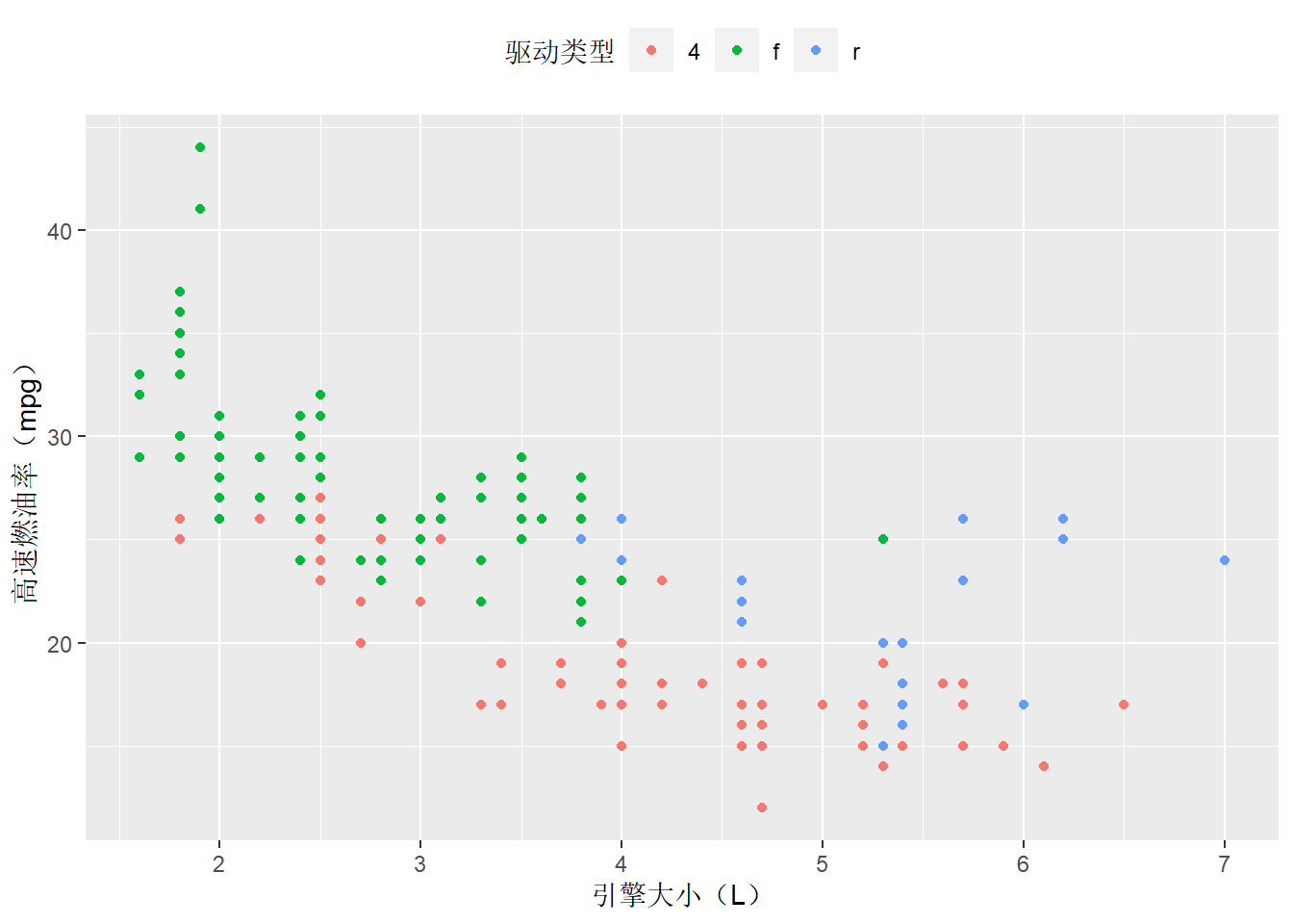
4.1.3.3 设置坐标轴范围
用coord_cartesian() 函数的参数xlim 和ylim, 或者用xlim(), ylim() 函数,设置x 轴和y 轴的范围
ggplot(mpg,aes(displ,hwy))+
  geom_point(aes(color=drv))+
  coord_cartesian(xlim = c(5,7),ylim = c(10,30))#或+xlim(5,7)+ylim(10,30)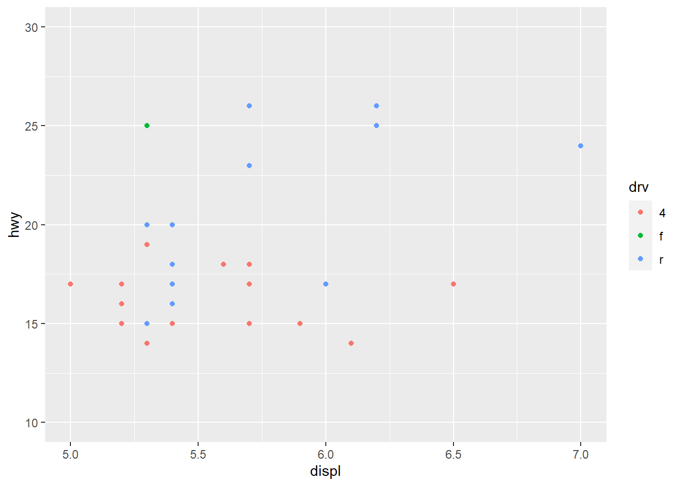
4.1.3.4 变换坐标轴
变换数据再绘图,比如对数变换,坐标刻度也会变成变换之后的,这使得图形不好理解。
ggplot2 提供的坐标变换函数scale_x_log10()等是变换坐标系,能够在视觉效果相同的情况下,使用原始数据的坐标刻度:
load("datas/gapminder.rda")
p=ggplot(gapminder,aes(gdpPercap, lifeExp)) +
  geom_point()+
  geom_smooth()
p+scale_x_continuous(labels = scales::dollar)
## `geom_smooth()` using method = 'gam' and formula = 'y ~ s(x, bs = "cs")'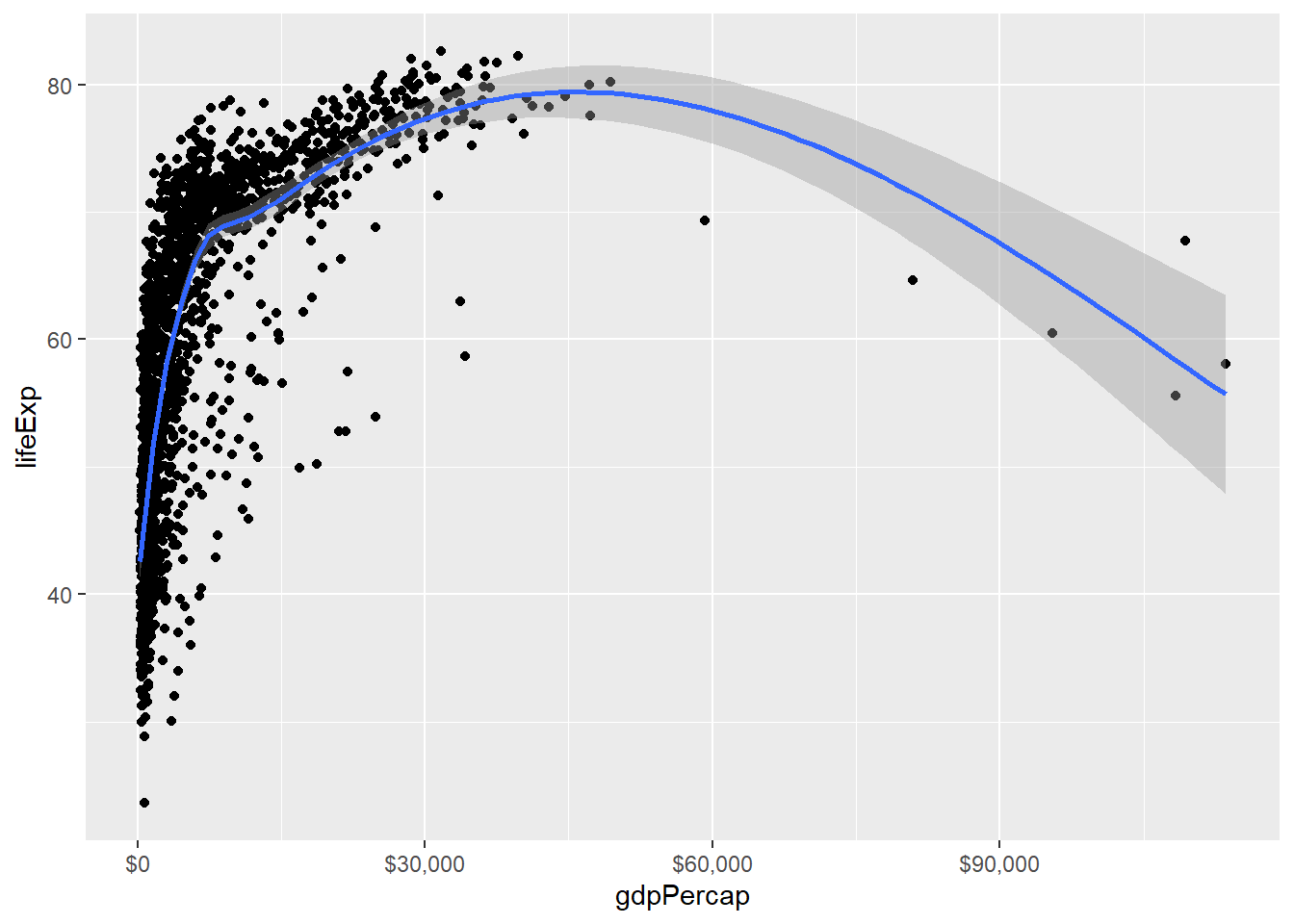
## `geom_smooth()` using method = 'gam' and formula = 'y ~ s(x, bs = "cs")'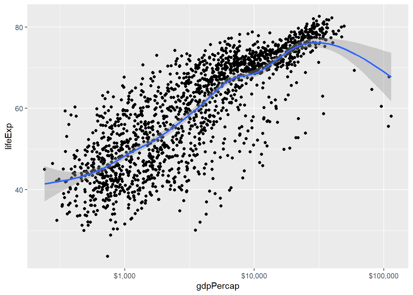
4.1.3.5 设置图形标题
用labs() 函数的参数title, subtitle, caption设置标题、副标题、脚注标题(默认右下角):
ggplot(mpg,aes(displ,hwy))+
  geom_point(aes(color=drv))+
  geom_smooth(se = FALSE)+
  labs(title = "燃油效率随引擎大小的变化图",
       subtitle = "两座车(跑车) 因重量小而符合预期",
       caption = "数据来自fueleconomy.gov")+
  #国外习惯图形标题位于顶部左端,如果想改成顶部居中,需要加theme 图层专门设置
  theme(plot.title = element_text(hjust = 0.5),
        plot.subtitle = element_text(hjust = 0.5))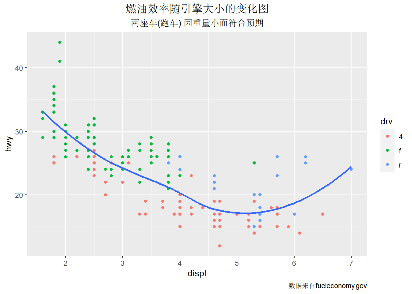
4.1.3.6 设置fill, color 颜色
数据的某个维度信息可以通过颜色来展示,颜色直接影响图形的美感。可以直接使用颜色值,但是更建议使用RColorBrewer(调色板)或colorspace 包。
- 离散变量
- manual: 直接指定分组使用的颜色
- hue: 通过改变色相(hue) 饱和度(chroma) 亮度(luminosity) 来调整颜色
- brewer: 使用ColorBrewer 的颜色
- grey: 使用不同程度的灰色
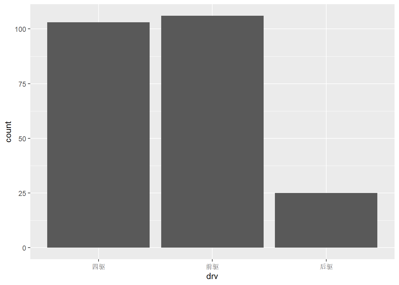
用scale_*_manual()手动设置颜色,并修改图例及其标签:
ggplot(mpg,aes(displ,hwy,color=drv))+
geom_point()+
scale_color_manual("驱动方式", #修改图例名
values = c("red","blue","green"),
breaks = c("4","f","r"),
labels=c("四驱","前驱","后驱"))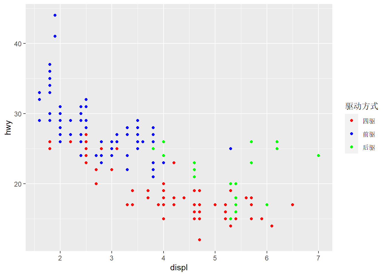 用scale_*_brewer() 调用调色版中的颜色:
查看所有可用的调色版:RColorBrewer::display.brewer.all()。
- 连续变量
- gradient: 设置二色渐变色
- gradient2: 设置三色渐变色
- distiller: 使用ColorBrewer 的颜色
- identity 使用color变量对应的颜色,对离散型和连续型都有效
用scale_color_gradient() 设置二色渐变色:
ggplot(mpg, aes(displ, hwy, color = hwy)) +
  geom_point() +
  scale_color_gradient(low="green",high = "red")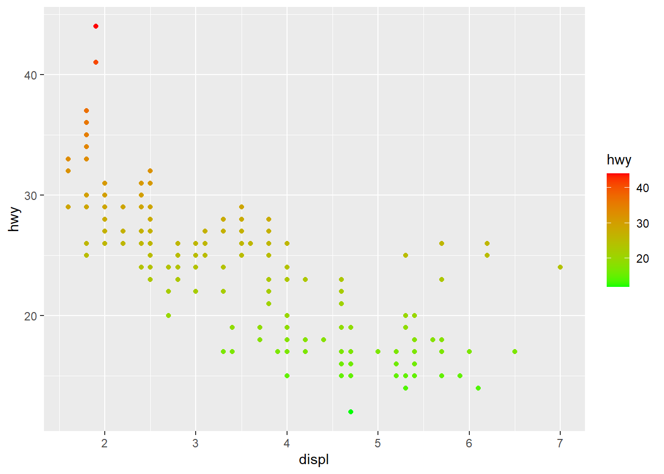
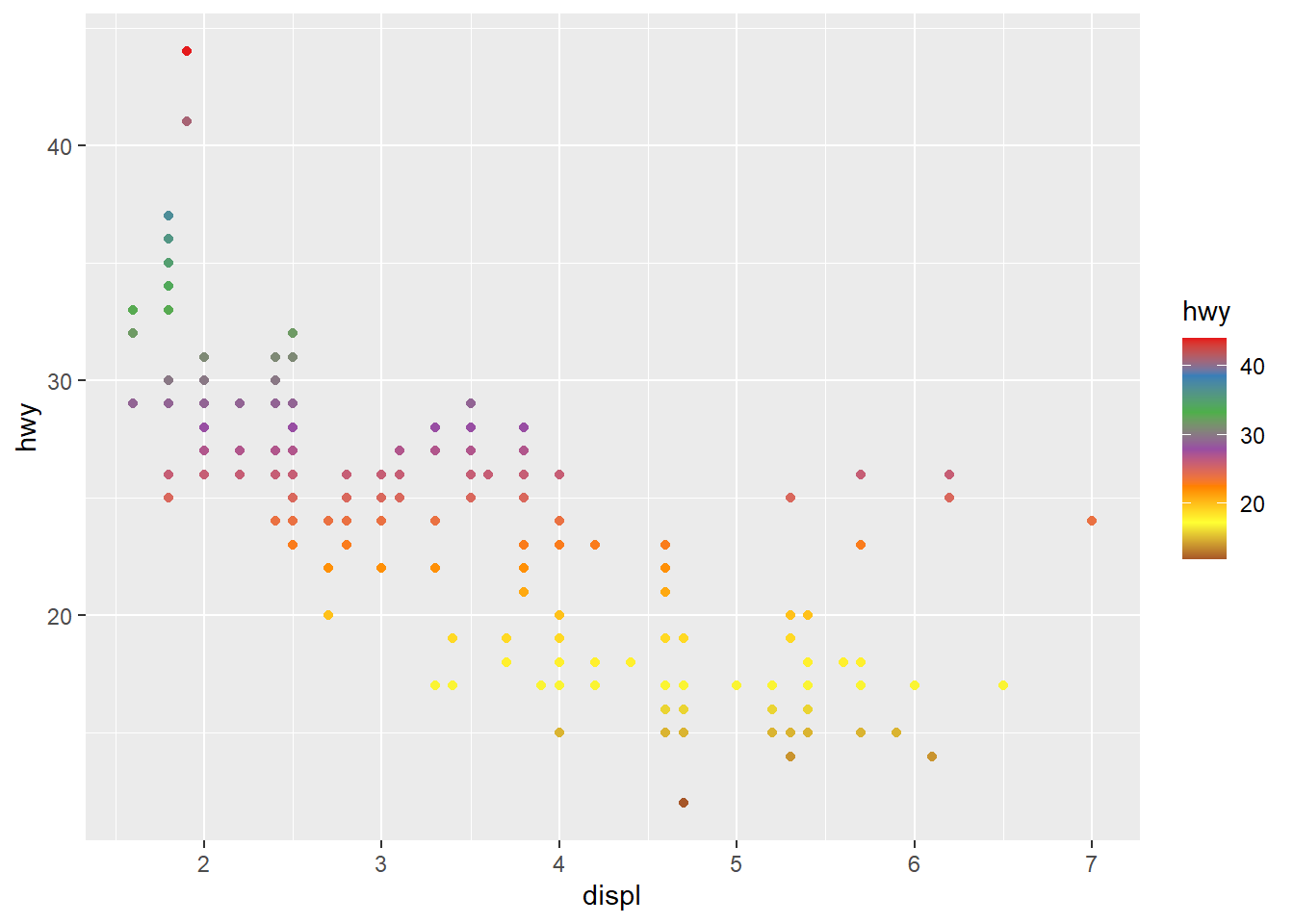
用scale_*_distiller() 调用调色版中的颜色:
4.1.3.7 添加文字标注
ggrepel 包提供了geom_label_repel() 和geom_text_repel() 函数,为图形添加文字标注。
首先要准备好标记点的数据,然后增加文字标注的图层,需要提供标记点数据,以及要标注的文字给label 美学,若来自数据变量,则需要用映射。
library(ggrepel)
best_in_class=mpg %>% ## 选取每种车型hwy 值最大的样本
  group_by(class) %>%
  slice_max(hwy,n=1)

ggplot(mpg,aes(displ,hwy))+
  geom_point(aes(color=class))+
  geom_label_repel(data = best_in_class,aes(label= model))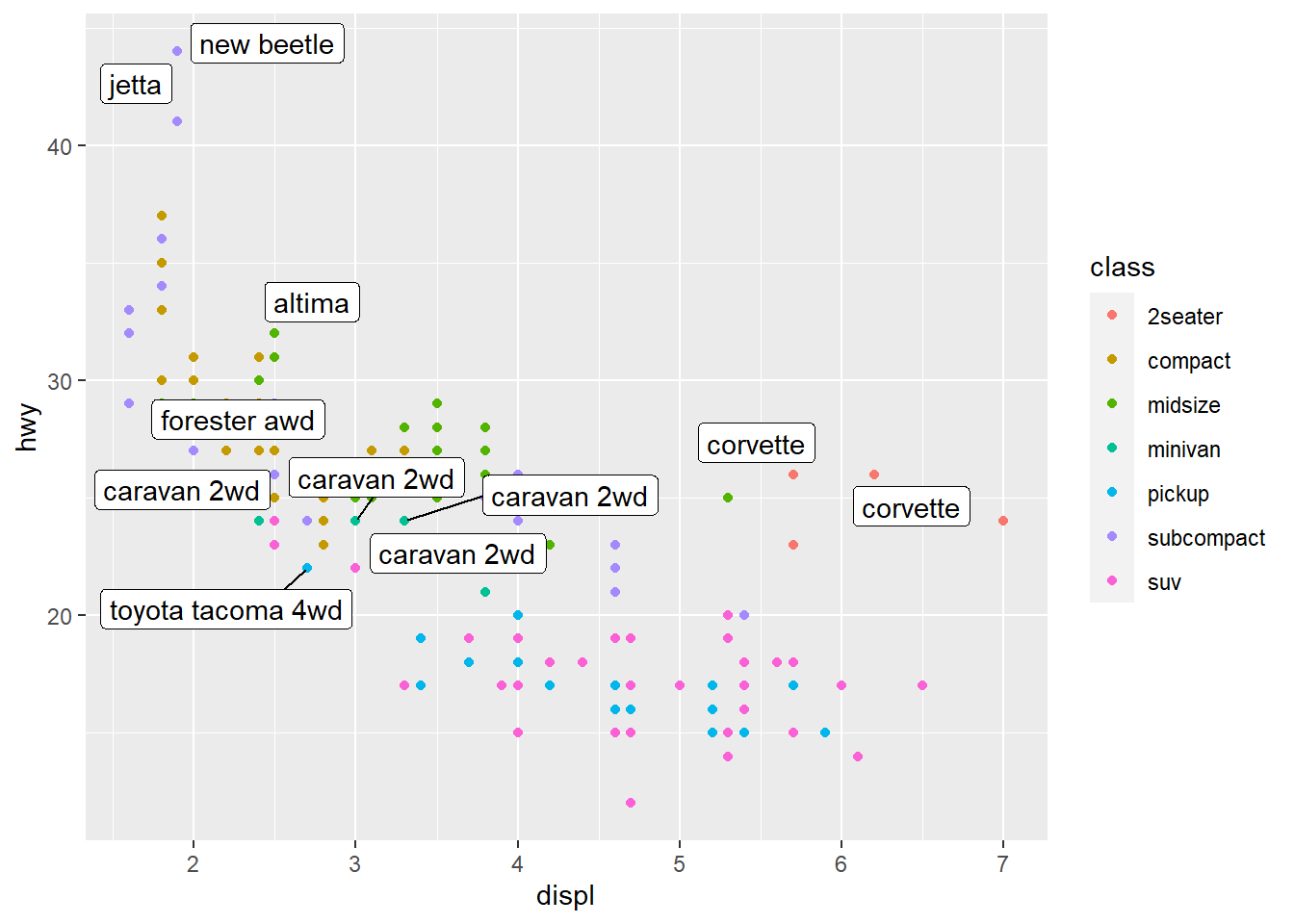
若要在图形某坐标位置添加文本注释,则用annotate() 函数,需要提供添加文本的中心坐标位 置,和要添加的文字内容:
ggplot(mpg,aes(displ,hwy))+
  geom_point()+
  annotate(geom = "text",x = 6,y = 40,
           label="引擎越大\n燃油效率越高!",
           size=4,color="red")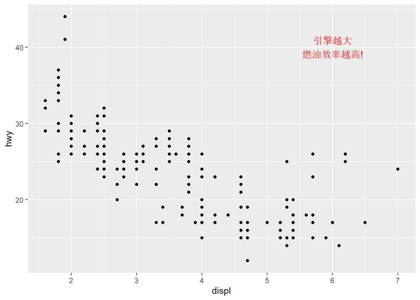
4.1.4 统计变换(Statistics)
4.1.4.1 为什么要做统计变换
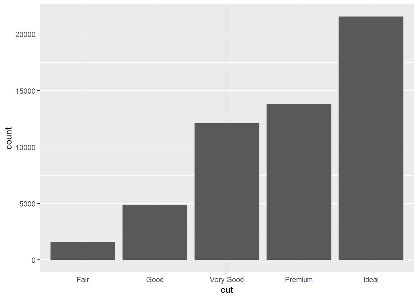
我们可以看到,mapping中只有cut映射到了x轴,并没有制定什么变量映射到y轴而图案中y轴的count变量在元素数据中是没有的答案是geom_bar在暗地里做了一个统计变换(stat),新生成了一个叫count的变量。
4.1.4.2 统计变换(stat)与几何对象(geom)的关系
大部分stat和geom之间是可以相互转换的 举个例子
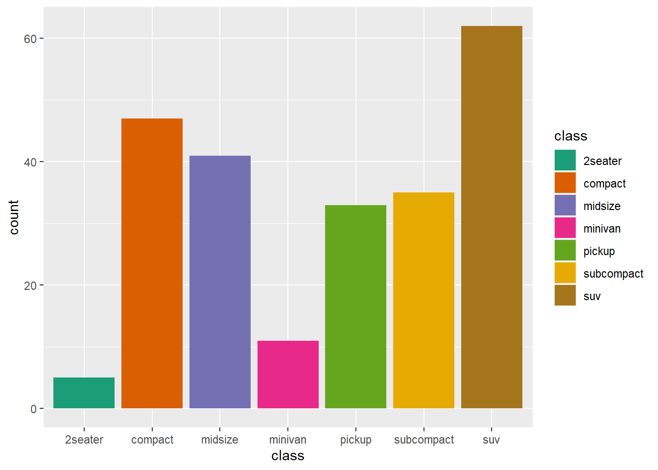
画出每个class(车型)对应计数的柱状图。
ggplot(mpg,aes(x = class))+
  geom_bar()+
  ggtitle("用geom_bar画图")
ggplot(mpg,aes(x = class))+
  stat_count()+
  ggtitle("用stat_count画图")
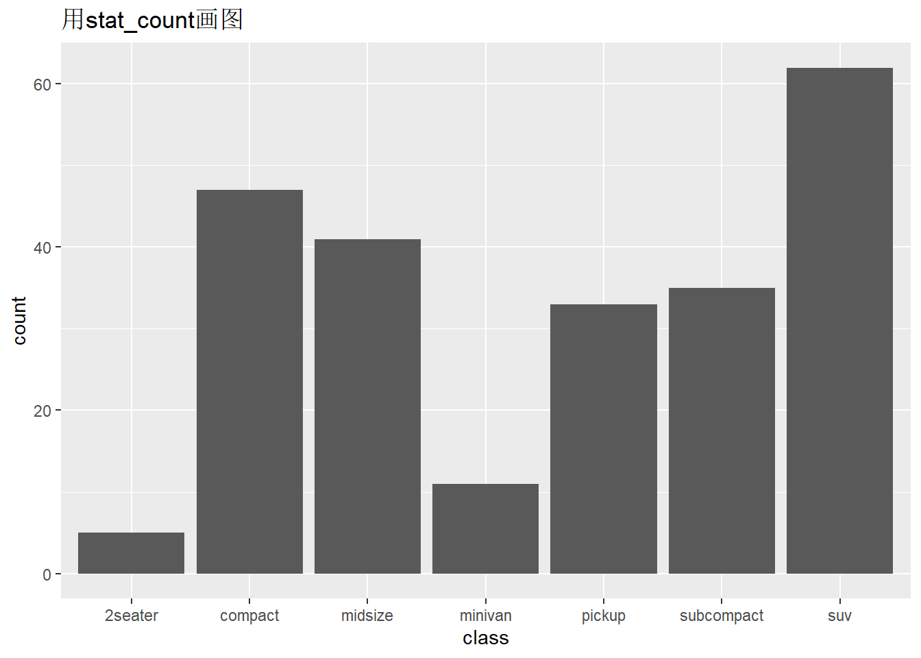
- geom_bar()和stat_count()是等价的。即geom_bar()默认的stat=“count”,stat_count()默认的geom=“bar”
此外,我们也可以先手动变换好数据之后,再绘图。
## # A tibble: 7 × 2
##   class      n_class
##   <chr>        <int>
## 1 2seater          5
## 2 compact         47
## 3 midsize         41
## 4 minivan         11
## 5 pickup          33
## 6 subcompact      35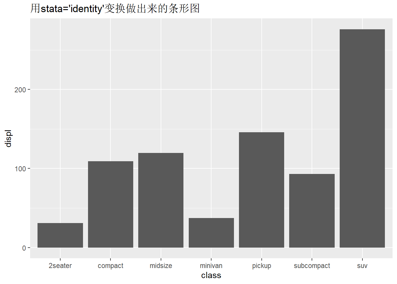
## 7 suv 62ggplot(data,aes(x = class, y=n_class))+
geom_bar(stat = "identity")+
ggtitle("用geom_bar画图")
ggplot(data,aes(x = class, y=n_class))+
geom_col()+
ggtitle("用geom_col画图")

- 在geom_bar()函数中更改stat参数从默认的”count”为”identity”后,和geom_col()函数等价,因为geom_col()函数默认的stat参数取值为”identity”。
例子二:绘制每个class对应出displ的合计。
## # A tibble: 7 × 2
##   class      n_displ
##   <chr>        <dbl>
## 1 2seater       30.8
## 2 compact      109.
## 3 midsize      120.
## 4 minivan       37.3
## 5 pickup       146.
## 6 subcompact    93.1
## 7 suv 276.ggplot(data = data,mapping = aes(x = class,y = n_displ))+
geom_bar(stat = "identity")+
ggtitle("用自己手动变换数据做出来的条形图")
ggplot(mpg,aes(x=class,y=displ)) +
geom_bar(stat="identity")+
ggtitle("用stata='identity'变换做出来的条形图")
- geom_bar()的position参数默认使用stack堆叠的方式,将所有柱子堆积成一根柱子,相当于对displ求和。
ggplot(mpg,aes(x=class,y=displ)) +
  stat_identity() # 散点图
ggplot(mpg,aes(x=class,y=displ)) +
  geom_point() # 等价于上一条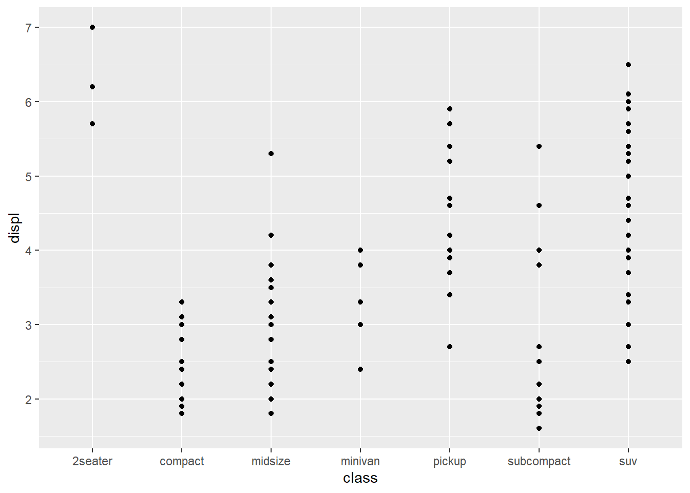

- geom_point和stat_identity互相默认,即geom_point()函数的stata参数的默认取值为”identity”,stat_indentity()函数的geom参数的默认取值为”point”。
4.1.4.3 stat与geom的定义及使用
要理解stat和geom内部的运行机制,我们可以看ggplot2包中的User guides, package vignettes and other documentation.里面的文章 extending-ggplot2和知乎专栏。这篇文章介绍了如何自己创建一个新的geom和新的stat,创建新的函数需要我们遇到具体问题时才要去做的事情,在这里我只想通过理解它的创建过程,来理解原有函数之间的关系。
4.1.4.4 统计变换
构建新的统计量进而绘图,称为‘‘统计变换’’,简称‘‘统计’’。比如,条形图、直方图都是先对数 据分组,再计算分组频数(落在每组的样本点数)绘图;箱线图计算稳健的分布汇总,并用特殊盒子 展示出来;平滑曲线用来根据数据拟合模型,进而绘制模型预测值. . . . . .
ggplot2 强大的一点就是,把统计变换直接融入绘图语法中,而不必先在外面对数据做统计变换, 再回来绘图。
ggplot2 中的提供了30 多种‘‘统计’’,均以stat_xxxx() 的方式命名。可以分为两类:
- 可以在几何对象函数geom_*() 中创建,通常直接使用后者即可
- stat_bin():geom_bar,geom_freqploy(),geom_histogram()
- stat_bindot():geom_dotplot()
- stat_boxplot():geom_box_plot()
- stat_contour():geom_contour()
- stat_quantile():geom_quantile()
- stat_smooth():geom_smmoth()
- stat_sum():geom_count()
- 不能在几何对象函数geom_*() 中创建:
- stat_ecdf(): 计算经验累积分布图
- stat_function(): 根据x 值的函数计算y 值
- stat_summary(): 在x 唯一值处汇总y 值
- stat_qq(): 执行Q-Q 图计算
- stat_spoke(): 转换极坐标的角度和半径为直角坐标位置
- stat_unique(): 剔除重复行
用stat_summary() 做统计汇总并绘图。通过传递函数做统计计算,首先注意x 和y 美学映射到calss 和hwy; fun = mean是根据x计算y,故对每个车型计算一个平均的hwy;fun.max, fun.min 同样根据x分别计算y的均值加减标准差;统计计算的结果将传递给几何对象参数geom 用于绘图:
ggplot(mpg,aes(x = class,y = hwy))+
geom_violin(trim = FALSE,alpha=0.5,color="green")+
stat_summary(fun=mean,
fun.min = function(x){mean(x)-sd(x)},
fun.max = function(x){mean(x)+sd(x)},
geom = "pointrange",color="red")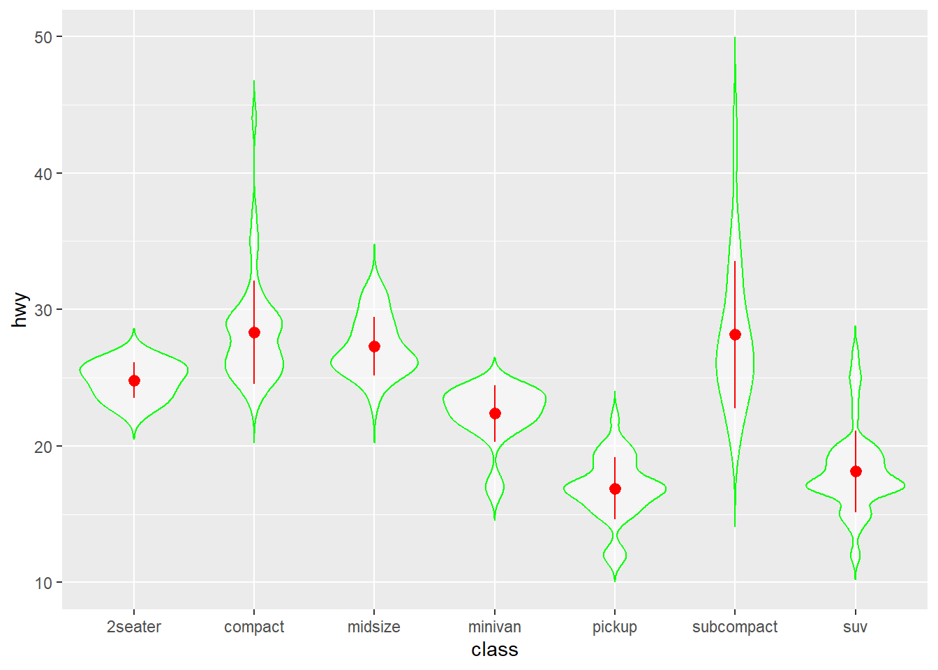 用stat_smooth(), 与geom_smooth() 相同, 添加光滑曲线:
- method: 指定平滑曲线的统计函数,如lm 线性回归, glm 广义线性回归, loess 多项式回归, gam 广义加法模型(mgcv 包) , rlm 稳健回归(MASS 包) 等
- formula: 指定平滑曲线的方程,如y ~ x, y ~ poly(x, 2), y ~ log(x) ,需要与method 参数搭配使用
- se: 设置是否绘制置信区间
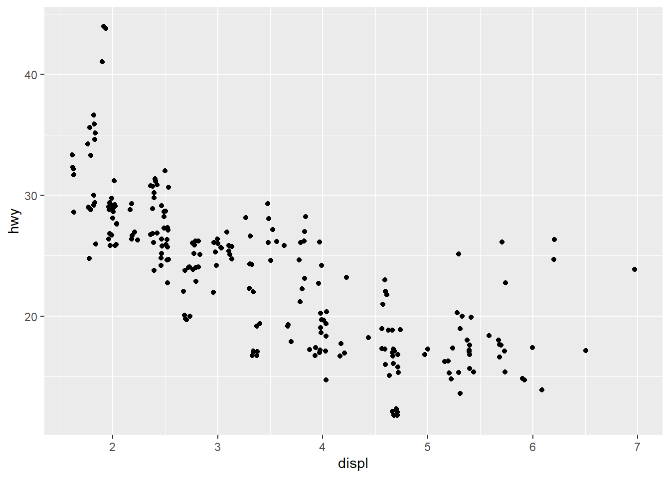
ggplot(mpg,aes(displ,hwy))+
  geom_point()+
  stat_smooth(method = "lm",
              formula = y~splines::bs(x,3),
              se = FALSE)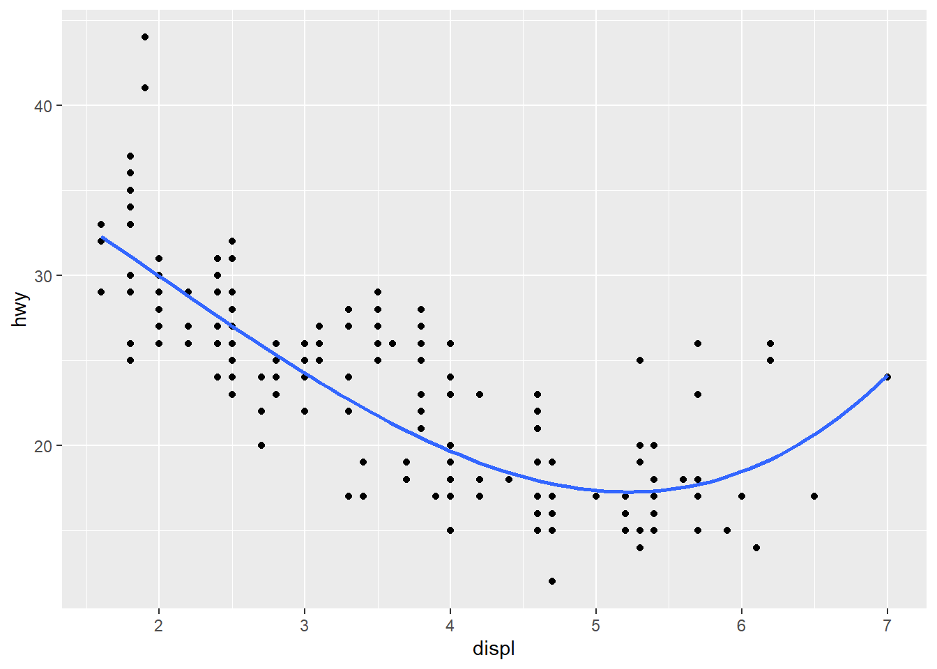
4.1.5 坐标系(Coordinante)
ggplot2 默认坐标系是笛卡尔直角坐标系coord_cartesian(),常用的坐标系操作还有:
- coord_flip():坐标轴翻转,即x 轴与y轴互换,比如绘制水平条形图
- coord_fixed(): 固定ratio = y / x 的比例
- coord_polar():转化为极坐标系,比如条形图转为极坐标系即为饼图
- coord_trans(): 彻底的坐标变换,不同于scale_x_log10() 等
- coord_map(), coord_quickmap(): 与geom_polygon() 连用,控制地图的坐标投影
- coord_sf(): 与geom_sf() 连用,控制地图的坐标投影
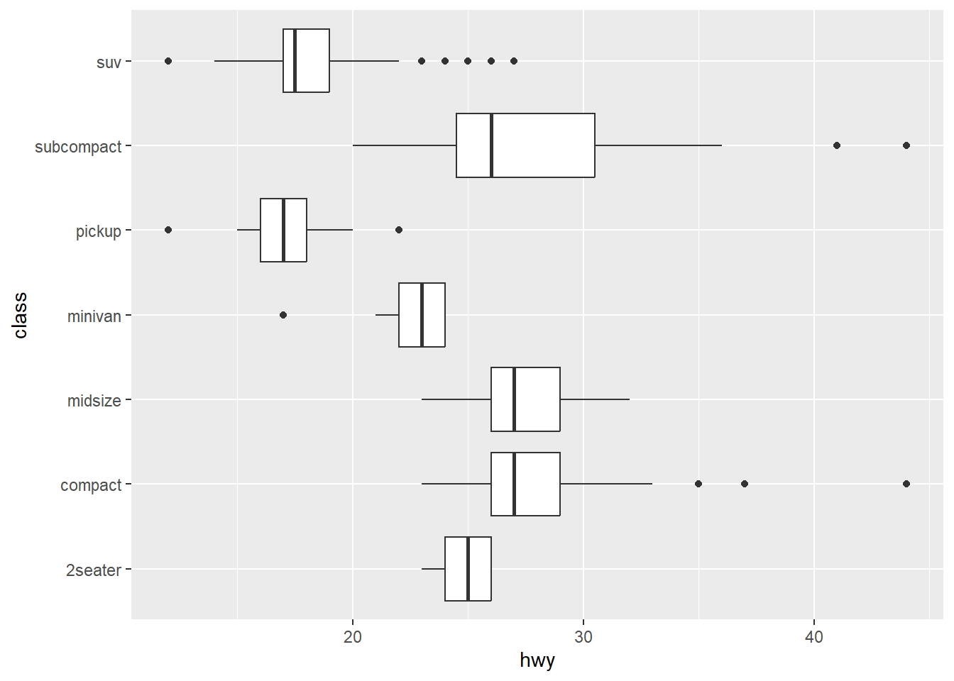
坐标轴翻转,从水平图到竖直图:
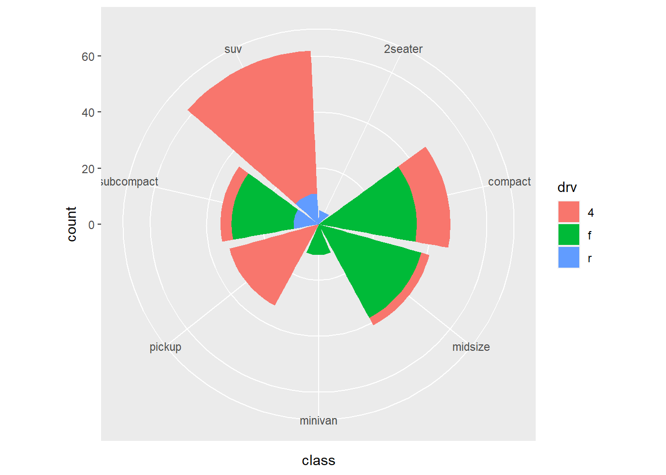
直角坐标下的条形图,转化为极坐标下的风玫瑰图:
4.1.6 位置调整(Position adjustments)
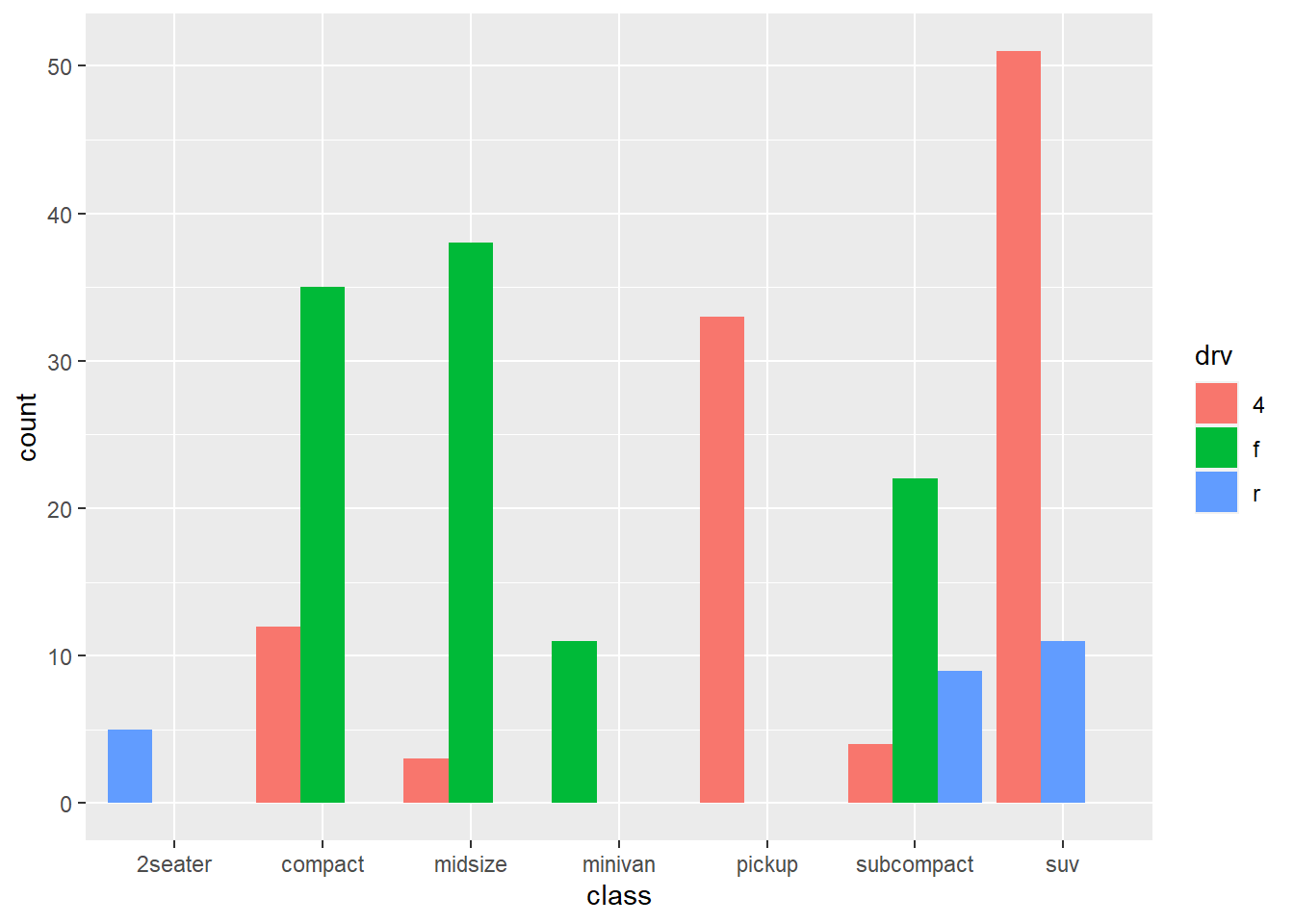
条形图中的条形位置调整:
- position_stack(): 竖直堆叠
- position_fill(): 竖直(百分比) 堆叠,按比例放缩保证总高度为1
- position_dodge(), position_dodge2(): 水平堆叠
散点图中的散点位置调整:
- position_nudge(): 将散点移动固定的偏移量
- position_jitter(): 给每个散点增加一点随机噪声(抖散图)
- position_jitterdodge(): 增加一点随机噪声并躲避组内的点,特别用于箱线图+ 散点图
有时候需要将多个图形排布在画板中,借助patchwork 包更方便。
library(patchwork)
p1 = ggplot(mpg, aes(displ, hwy)) +
  geom_point()
p2 = ggplot(mpg, aes(drv, displ)) +
  geom_boxplot()
p3 = ggplot(mpg, aes(drv)) +
  geom_bar()
p1|(p2/p3)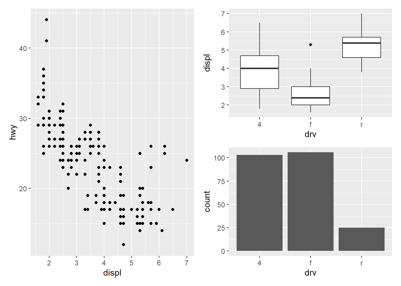
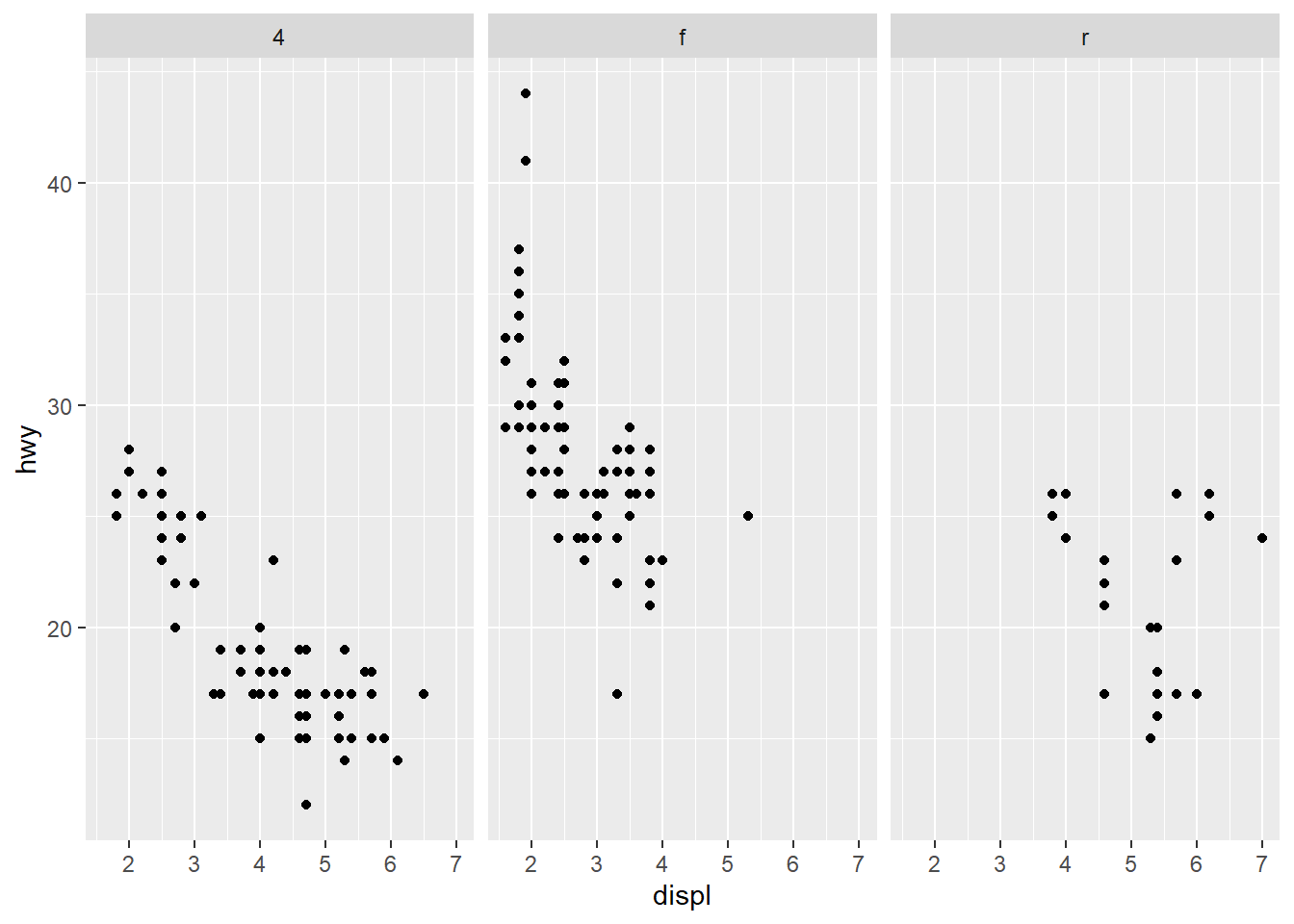
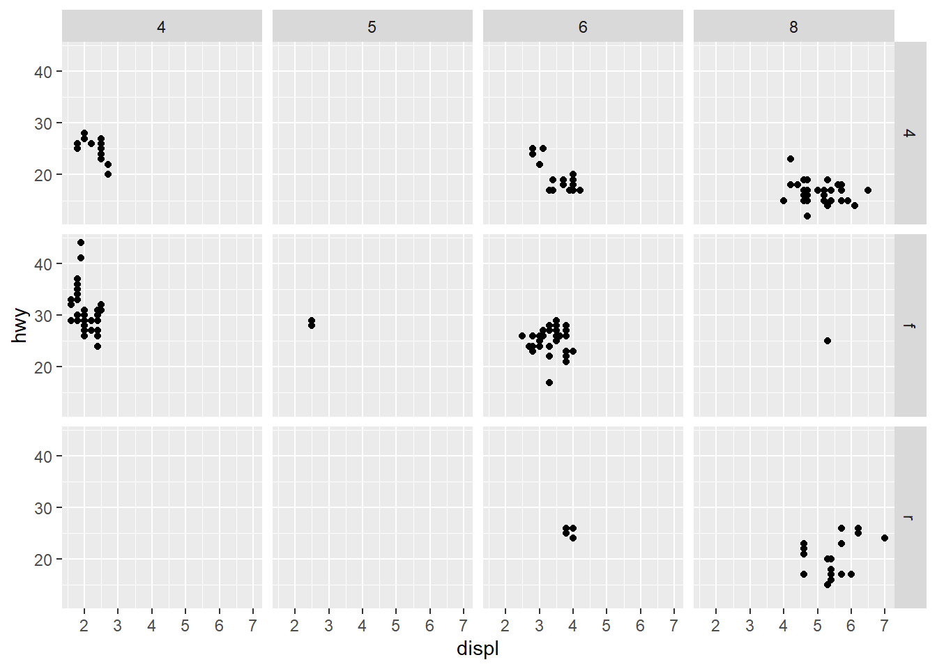
4.1.7 分面(Facet)
利用分类变量将图形分为若干个“面” (子图),即对数据分组再分别绘图,称为“分面”
- facet_wrap()
封装分面,先生成一维的面板系列,再封装到二维中。
- 分面形式:~ 分类变量, ~ 分类变量1 + 分类变量2
- scales 参数设置是否共用坐标刻度,“fixed”(默认, 共用), “free”(不共用),也可以用free_x,free_y 单独设置
- 参数nrow 和ncol 可设置子图的放置方式
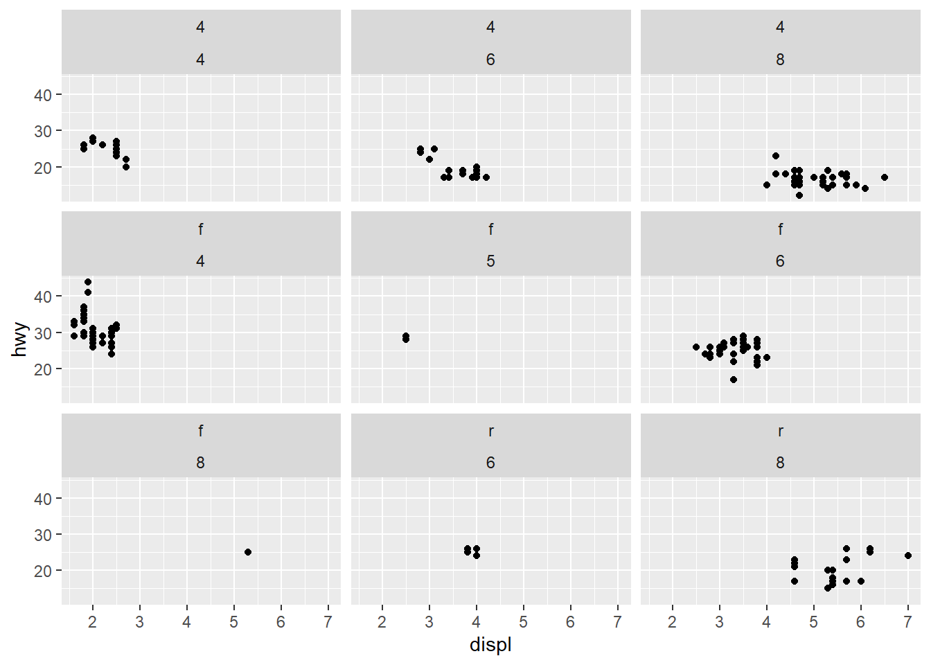
- facet_grid()
网格分面,生成二维的面板网格,面板的行与列通过分面变量定义。
- 分面形式:行分类变量~ 列分类变量
4.1.8 主题(theme)
- theme_bw()
- theme_light()
- theme_classic()
- theme_gray(): 默认
- theme_linedraw()
- theme_dark()
- theme_minimal()
- theme_void()
更多的主题,还可以用ggthemes 包,其中包含一些顶级期刊专用绘图主题;当然也可以用theme()函数定制自己的主题(略)。
4.1.9 输出(output)
用ggsave() 函数,将当前图形保存为想要格式的图形文件,如png, pdf 等:
最后,再补充一点关于图形中使用中文字体导出到pdf 等图形文件出现乱码问题的解决办法。
出现中文乱码是因为R 环境只载入了“sans (Arial),” “serif (Times New Roman),” “mono (Courier New)” 三种英文字体,没有中文字体可用。
解决办法就是从系统字体中载入中文字体,用showtext 包(依赖sysfonts 包)更简单一些。
- font_paths(): 查看系统字体路径,windows 默认是C:
- font_files(): 查看系统自带的所有字体文件
- font_add(): 从系统字体中载入字体,需提供family 名字,字体路径
载入字体后,再执行一下showtext_auto() (启用/关闭功能), 就可以使用该字体了。
ggpplot2 中各种设置主题、文本相关的函数*_text(), annotate() 等,都提供了family 参数,设定为font_add() 中一致的family 名字即可。
## Loading required package: sysfonts## Loading required package: showtextdbfont_add("heiti", "simhei.ttf")
font_add("kaiti", "simkai.ttf")
showtext_auto()
ggplot(mpg,aes(displ,hwy,color=drv))+
geom_point()+
theme(axis.title = element_text(family = "heiti"),
plot.title = element_text(family = "kaiti"))+
xlab(" 发动机排量(L)") +
ylab(" 高速里程数(mpg)") +
ggtitle(" 汽车发动机排量与高速里程数") +
annotate("text", 5, 35, family = "kaiti", size = 8,
label = " 设置中文字体", color = "red")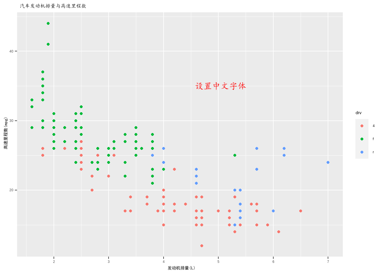
4.2 自定义ggplot2函数
4.2.2 单个组件
方法一:重复使用的代码片段存为对象
ggplot图的每个组件都是一个对象。大多数情况下,我们创建组件并立即将其添加到绘图中,但其实并不需要这么做。相反,我们可以将任何组件保存为一个变量(给它一个名字),然后将它添加到多个绘图中:
## Warning: Using `size` aesthetic for lines was deprecated in ggplot2 3.4.0.
## ℹ Please use `linewidth` instead.
## This warning is displayed once every 8 hours.
## Call `lifecycle::last_lifecycle_warnings()` to see where this warning was
## generated.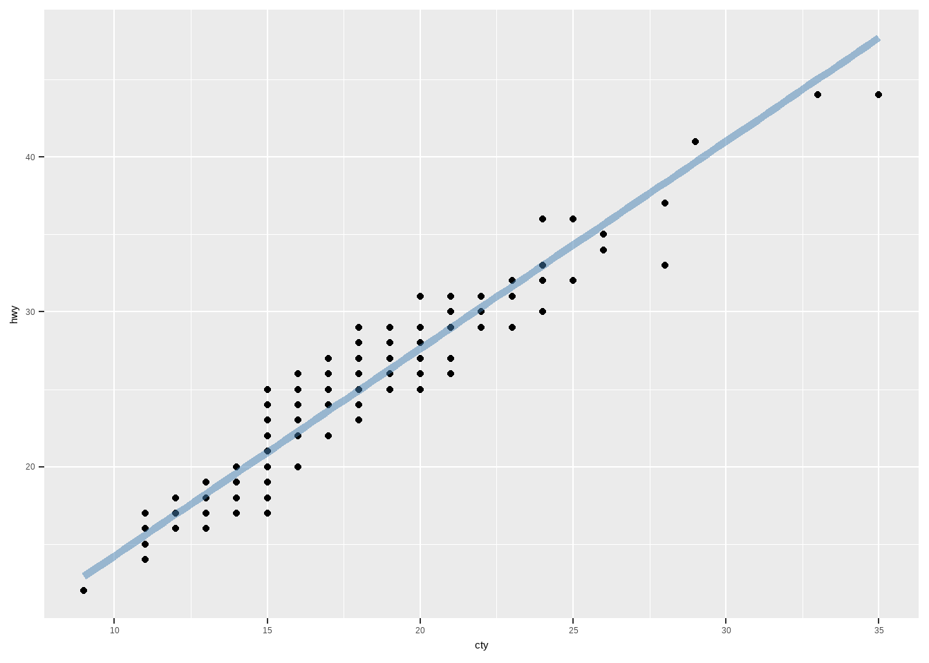
这是减少简单复制类型的一种方法(比复制粘贴好多了!),但要求组件每次都完全相同。如果需要更大的灵活性,可以将这些可重复使用的代码片段放在在一个函数中。
方法二:重复使用的代码片段放在函数
例如,我们可以扩展bestfit对象成一个更普适性的函数,给图中增加一条最佳拟合线。下面的代码创建了一个geom_lm()函数,有三个参数,模型的formula,拟合线条的color和拟合线的粗细size:
geom_lm <- function(formula=y~x,color=alpha("steelblue",0.5),
size=2,...){
geom_smooth(formula = formula,se=FALSE,method = "lm",color=color,
size=size,...)
}
ggplot(mpg, aes(displ, 1 / hwy)) +
geom_point()+
geom_lm()
ggplot(mpg,aes(displ,1/hwy))+
geom_point()+
geom_lm(y ~ poly(x,2),size=1,color="red") #等价于formula = y~x+I(x^2)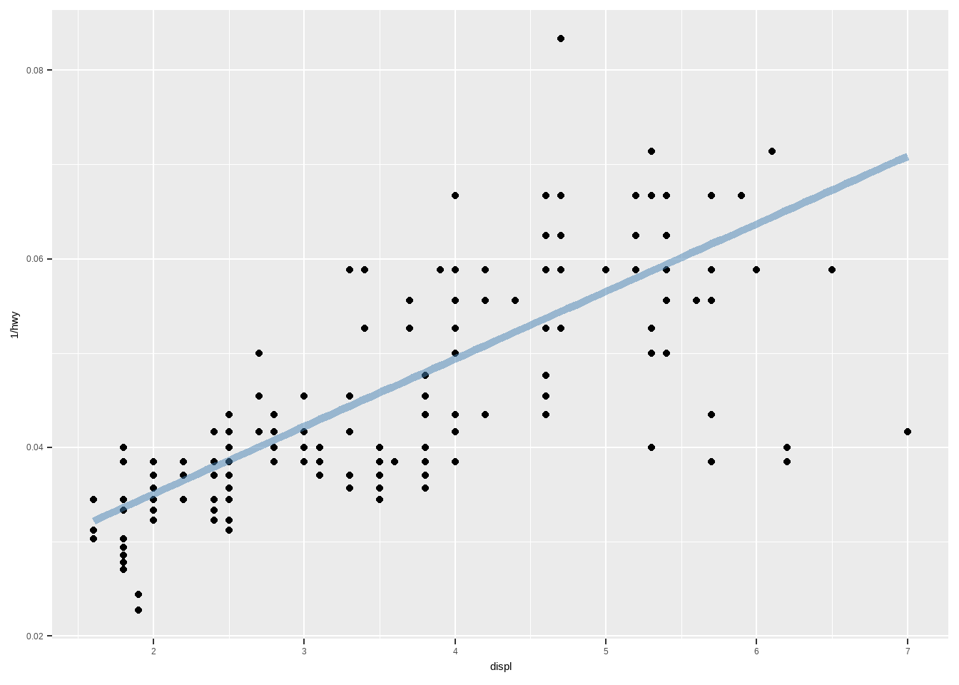
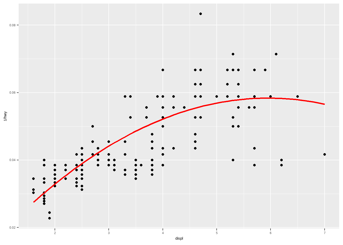
请注意”…“的用法。 在函数中定义缺省参数”…“允许函数接受任意的附加参数。 在函数内部,你可以使用”…” 将这些参数传递给另一个函数。 本例中,将”…“传递到geom_smooth()中,这样就可以修改我们没有显式覆盖的其他参数。 当编写自己的组件函数时,最好总是使用“…” 这种方式。
4.3 散点图
4.3.1 密度散点图
绘制散点图时,若散点数目很多,散点之间相互重叠,则不易观察散点趋势,此时可绘制密度散点图解决。
加载R包并生成相关数据
library(ggplot2)
library(dplyr)
library(viridis) # 使用viridis提供的翠绿色标度:scale_fill_viridis()
library(ggpointdensity) # 绘制密度散点图
library(cowplot) # 图形组合,可以自动对其坐标轴
dat <- bind_rows(
tibble(x = rnorm(7000, sd = 1),
y = rnorm(7000, sd = 10),
group = "foo"),
tibble(x = rnorm(3000, mean = 1, sd = .5),
y = rnorm(3000, mean = 7, sd = 5),
group = "bar"))绘图
# 散点图
p1 <- ggplot(data = dat, mapping = aes(x = x, y = y)) +
geom_point() +
labs(tag = "A") + # 添加子图标记
theme_classic()
# 散点图+密度线(geom_density2d)
p2 <- ggplot(data = dat, mapping = aes(x = x, y = y)) +
geom_point() +
geom_density2d(size = 1) +
labs(tag = "B") +
theme_classic()
# 封箱散点图(geom_bin2d)
p3 <- ggplot(data = dat, mapping = aes(x = x, y = y)) +
geom_bin2d(bins = 60) + # bins控制着图中每个箱子的大小
scale_fill_viridis() +
labs(tag = "C") +
theme_classic()
# 密度散点图(geom_pointdensity)
p4 <- ggplot(data = dat, mapping = aes(x = x, y = y)) +
geom_pointdensity() +
scale_color_viridis() +
labs(tag = "D") +
theme_classic()
# 组合4幅图形
plot_grid(p1, p2, p3, p4, nrow = 2)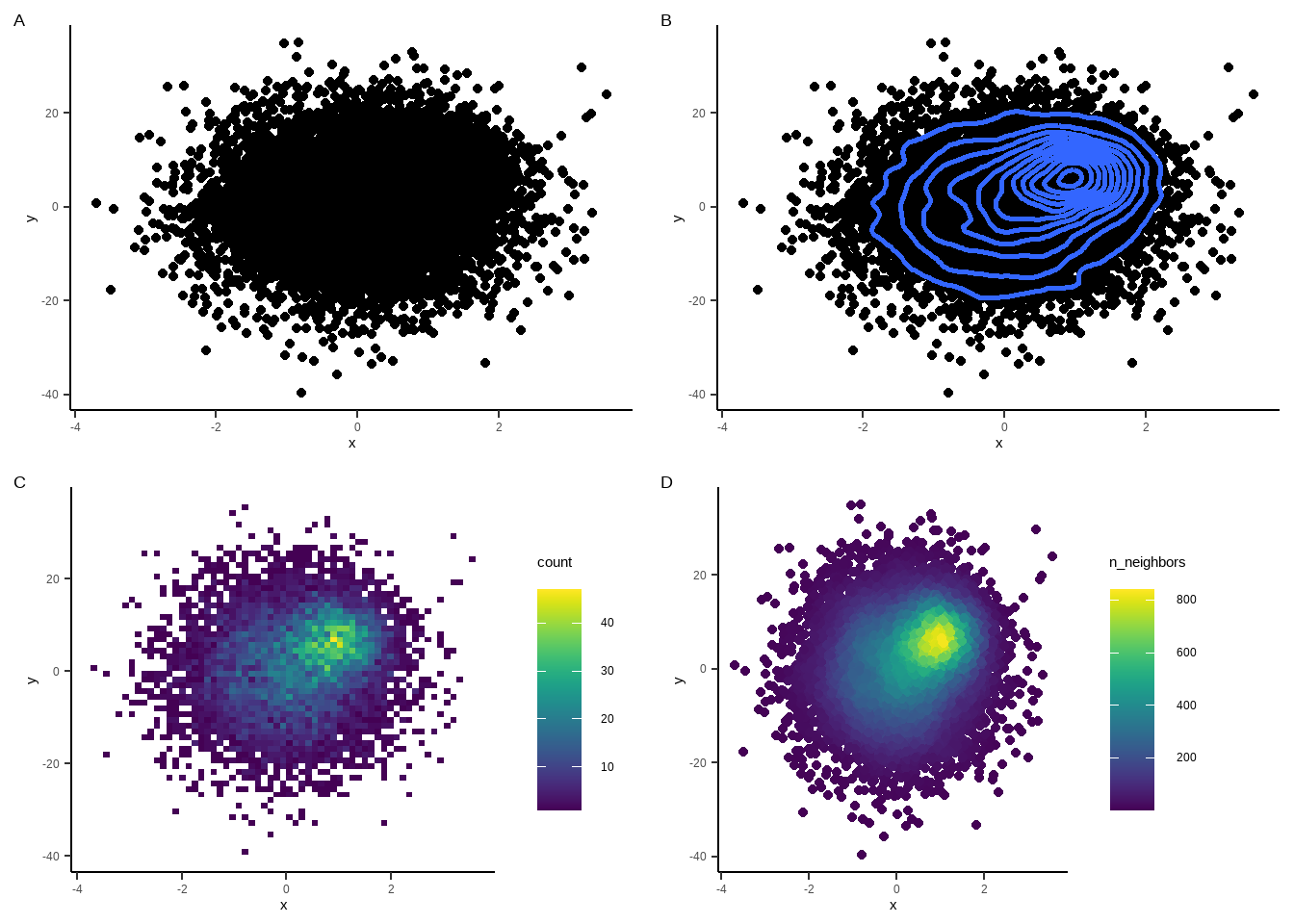
4幅图的比较
geom_point为ggplot2自带的绘图函数;A图各位置点的数量观察不清
geom_density2d为ggplot2自带的绘图函数,可以绘制密度等高线(图B)
geom_bin2d为ggplot2自带的绘图函数;先将散点封箱处理,然后绘制出箱子,箱子的颜色取决于箱子内散点的数量(图C)
geom_pointdensity为ggpointdensity包的函数;各散点的颜色取决于改点周围临近点的数量(图D) 图C与图D效果类似,但图C的箱子已不再是真实的散点,而图D为真实的散点;比较图C、图D与原始图A的散点稀疏区域便可发现
4.3.2 散点图+密度曲线
本部分参考知乎:散点图+直方图+密度曲线
#加载相关的包
library(ggplot2)
library(ggExtra)
library(cowplot) # 图形组合,可以自动对其坐标轴
#加载数据
dat <- bind_rows(
tibble(x = rnorm(500, sd = 1),
y = rnorm(500, sd = 3),
group = "foo"),
tibble(x = rnorm(500, mean = 1, sd = .5),
y = rnorm(500, mean = 7, sd = 2),
group = "bar"))
p1 <- ggplot(data = dat, mapping = aes(x = x, y = y)) +
geom_point(aes(color=group))+
stat_smooth(method=lm)+
theme_bw()+ #黑白背景
theme(legend.position="none") #删除图注
#在散点图上添加密度曲线
p2 <- ggExtra::ggMarginal(p1, type = "density", #指定添加类型
xparams=list(fill = "green"), #指定颜色
yparams = list(fill="orange"), #指定颜色
)
#在散点图上添加histogram
p3 <- ggExtra::ggMarginal(p1, type = "histogram", #指定添加类型
xparams=list(fill = "green"), #指定颜色
yparams = list(fill="orange"), #指定颜色
)
#根据性别分组添加密度曲线
p4 <- ggExtra::ggMarginal(p1, type = "density",
xparams=list(fill = "green"),
yparams = list(fill="orange"),
groupColour = T,
groupFill=T #根据组别进行填充
)
plot_grid(p1, p2, p3,p4)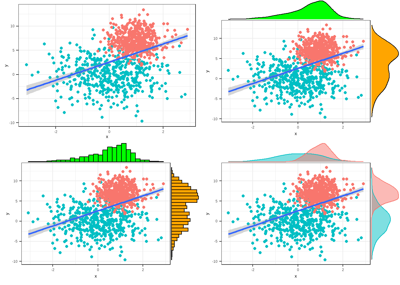
4.4 箱线图
一个分类变量的箱线图
绘制阿司匹林、P2Y抑制剂和双抗的PDC箱线图
## # A tibble: 6 × 10
## grbm PDC_of_ASA pdc_of_ASA index_ACS_type index_reval p2y_type PDC_of_P2Y
## <dbl> <dbl> <dbl> <chr> <dbl> <chr> <dbl>
## 1 197 0.475 0.600 MI 0 氯吡格雷 0.825
## 2 637 0.575 0.600 UA 1 氯吡格雷 1
## 3 641 0.682 0.800 MI 0 氯吡格雷 0.989
## 4 741 0.0849 0.200 UA 0 氯吡格雷 0.00822
## 5 797 0.504 0.600 UA 0 氯吡格雷 0.962
## 6 1607 0.748 0.800 UA 0 混用 0.0521
## # ℹ 3 more variables: pdc_of_P2Y <dbl>, PDC_of_DAPT <dbl>, pdc_of_DAPT <dbl># 数据转换
data_1 <- data %>%
select(grbm,PDC_of_ASA,PDC_of_P2Y,PDC_of_DAPT) %>%
pivot_longer(cols = PDC_of_ASA:PDC_of_DAPT,names_to = "type",values_to = "PDC_value") %>% #变为长数据
mutate(type=factor(type,levels = c("PDC_of_ASA","PDC_of_P2Y","PDC_of_DAPT"),labels = c("ASA","P2Y","DAPT"))) #将type变量变为因子型,这样横坐标就可以按因子水平顺序排列
head(data_1)## # A tibble: 6 × 3
## grbm type PDC_value
## <dbl> <fct> <dbl>
## 1 197 ASA 0.475
## 2 197 P2Y 0.825
## 3 197 DAPT 0.425
## 4 637 ASA 0.575
## 5 637 P2Y 1
## 6 637 DAPT 0.575ggplot(data = data_1,aes(x = type,y = PDC_value))+
stat_boxplot(geom="errorbar",width=0.1,size=0.5,color="black")+ ##绘制误差棒
geom_boxplot( #绘制箱图
fill="#B5E7FF",
size=0.5,
width=0.5,
color="black",
notch = F,
notchwidth = 0.5)+
theme(axis.title = element_text(size=18),
axis.text = element_text(size=14))+
theme_bw()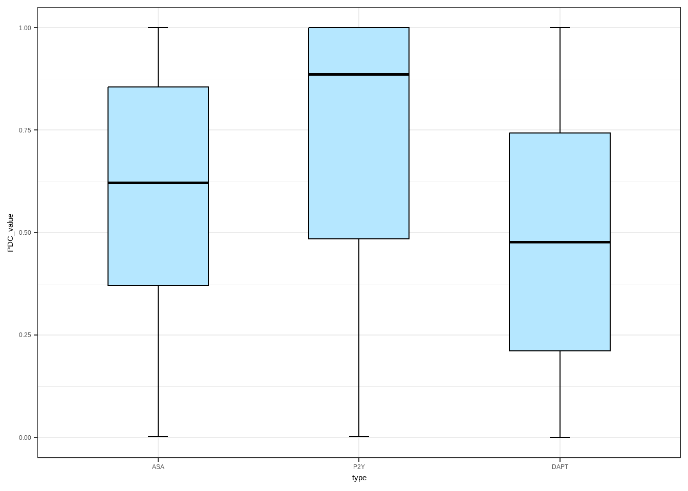 绘制两个变量的箱线图
data_new <- data %>%
select(grbm,index_reval,PDC_of_ASA,PDC_of_P2Y,PDC_of_DAPT) %>%
pivot_longer(cols = PDC_of_ASA:PDC_of_DAPT,names_to = "type",values_to = "PDC_value") %>%
mutate(index_reval=factor(index_reval,levels = c(1,0),labels = c("reval","non-reval")),
type=factor(type,levels = c("PDC_of_ASA","PDC_of_P2Y","PDC_of_DAPT"),labels = c("ASA","P2Y","DAPT")))
head(data_new)## # A tibble: 6 × 4
## grbm index_reval type PDC_value
## <dbl> <fct> <fct> <dbl>
## 1 197 non-reval ASA 0.475
## 2 197 non-reval P2Y 0.825
## 3 197 non-reval DAPT 0.425
## 4 637 reval ASA 0.575
## 5 637 reval P2Y 1
## 6 637 reval DAPT 0.575ggplot(data = data_new,aes(x = type,y = PDC_value))+
stat_boxplot(aes(fill=index_reval),
geom="errorbar",width=0.1,size=0.5,
position=position_dodge(0.6),color="black")+
geom_boxplot(aes(fill=index_reval),outlier.colour = NA,
position=position_dodge(0.6),
size=0.5,
width=0.5,
color="black",
notch = F,
notchwidth = 0.5)+
theme(axis.title = element_text(size=18),
axis.text = element_text(size=14))+
theme_bw()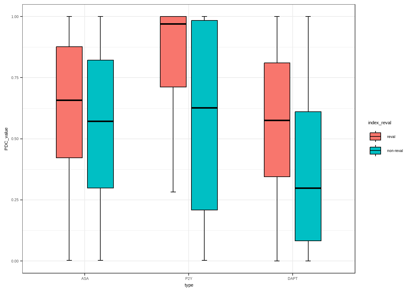
进阶
data_new <- data %>%
select(grbm,index_reval,PDC_of_ASA,PDC_of_P2Y,PDC_of_DAPT) %>%
pivot_longer(cols = PDC_of_ASA:PDC_of_DAPT,names_to = "type",values_to = "PDC_value") %>%
mutate(index_reval=factor(index_reval,levels = c(1,0),labels = c("血运重建","非血运重建")),
type=factor(type,levels = c("PDC_of_ASA","PDC_of_P2Y","PDC_of_DAPT"),labels = c("ASA","P2Y","DAPT")))
p <- ggplot(data = data_new,aes(x = type,y = PDC_value))+
stat_boxplot(aes(fill=index_reval),
geom="errorbar",width=0.1,size=0.5,
position=position_dodge(0.6),color="black")+
geom_boxplot(aes(fill=index_reval),outlier.colour = NA,
position=position_dodge(0.6),
size=0.5,
width=0.5,
color="black",
notch = F,
notchwidth = 0.5)+
theme(axis.title = element_text(size=18),
axis.text = element_text(size=14))+
theme_bw()+
scale_y_continuous(breaks = seq(0, 1.2, by = 0.2))+
scale_x_discrete(labels = c("ASA" = "阿司匹林", "P2Y" = "P2Y抑制剂",
"DAPT" = "双抗"))+
labs(x = "药物类型", y = "PDC",fill="分组") ##fill此处代表图例名,离散变量应该是col
df1 <- data.frame(a=c(0.85,0.85,1.15,1.15),
b=c(1.02,1.05,1.05,1.02))
df2 <- data.frame(a=c(1.85,1.85,2.15,2.15),
b=c(1.02,1.05,1.05,1.02))
df3 <- data.frame(a=c(2.85,2.85,3.15,3.15),
b=c(1.02,1.05,1.05,1.02))
p <- p+#按照设定的位置绘制横线
geom_line(data=df1,aes(a,b),cex=0.5)+
geom_line(data=df2,aes(a,b),cex=.5)+
geom_line(data=df3,aes(a,b),cex=.5)+
#添加显著性标记信息
annotate('text',x=1,y=1.08,label="p<0.001",
size=3,color='black')+
annotate('text',x=2,y=1.08,label="p<0.001",
size=3,color='black')+
annotate('text',x=3,y=1.08,label="p<0.001",
size=3,color='black')
p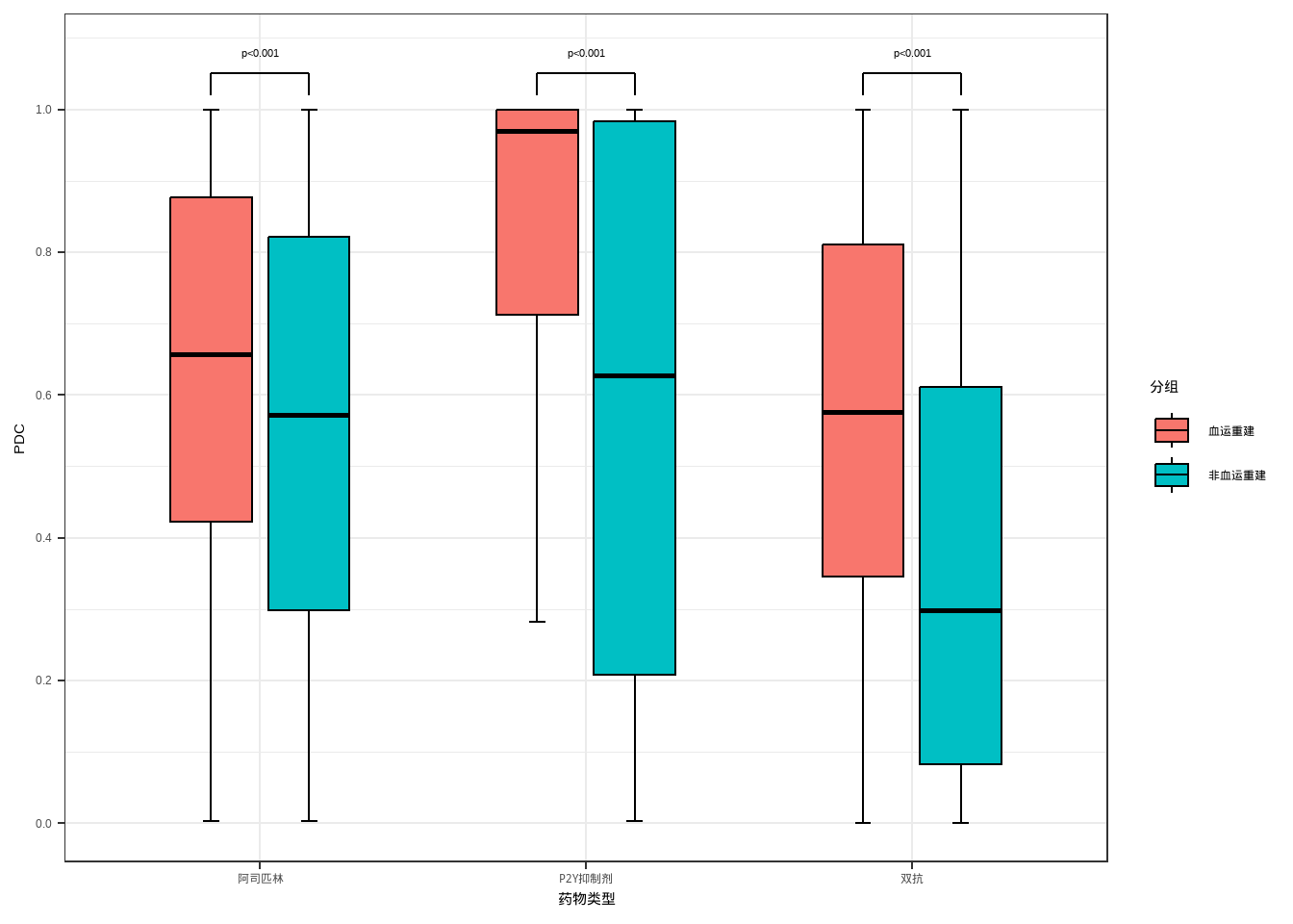
4.5 生存分析
前期数据处理
library(tidyverse)
library(survival)
library(survminer)
file1 <- foreign::read.dta(file = "F:/wlzp/AD_KM/file1.dta")
file2 <- foreign::read.dta(file = "F:/wlzp/AD_KM/file2.dta")
data1 <- tibble::tibble(grbm=file1$grbm,
dy90=file1$signal90,
dysj=file1$timetg,
arm=file1$cohort)
data2 <- tibble::tibble(grbm=file2$grbm,
dy90=file2$signal90,
dysj=file2$timetg,
arm=file2$cohort)
data <- bind_rows(data1,data2) %>%
mutate(cohort=case_when(arm==1 ~ "treatment-naive",
arm==2 ~ "previously treated",
arm==3 ~ "totol"
)) %>%
select(-arm)画生存曲线
fit<-survfit(Surv(dysj,dy90 == 1)~cohort,data = data)
p <- ggsurvplot(fit,data = data,
palette = c("#E7B800", "#2E9FDF","#F39902"),
conf.int = TRUE,
risk.table = FALSE,
xlab= "proportion of persistence %",
ylab= "proportion of persistence %",
ggtheme = theme_bw(), # Change ggplot2 theme
legend.title = c(""),
legend= "right",
legend.labs = c("treatment-naive","previously treated","totol"),
censor=FALSE)
export::graph2ppt(x=p$plot,
file="F:/wlzp/AD_KM/p.pptx", width=5, height=3)4.6 Plotly
4.6.1 将ggplot对象转化为plotly对象
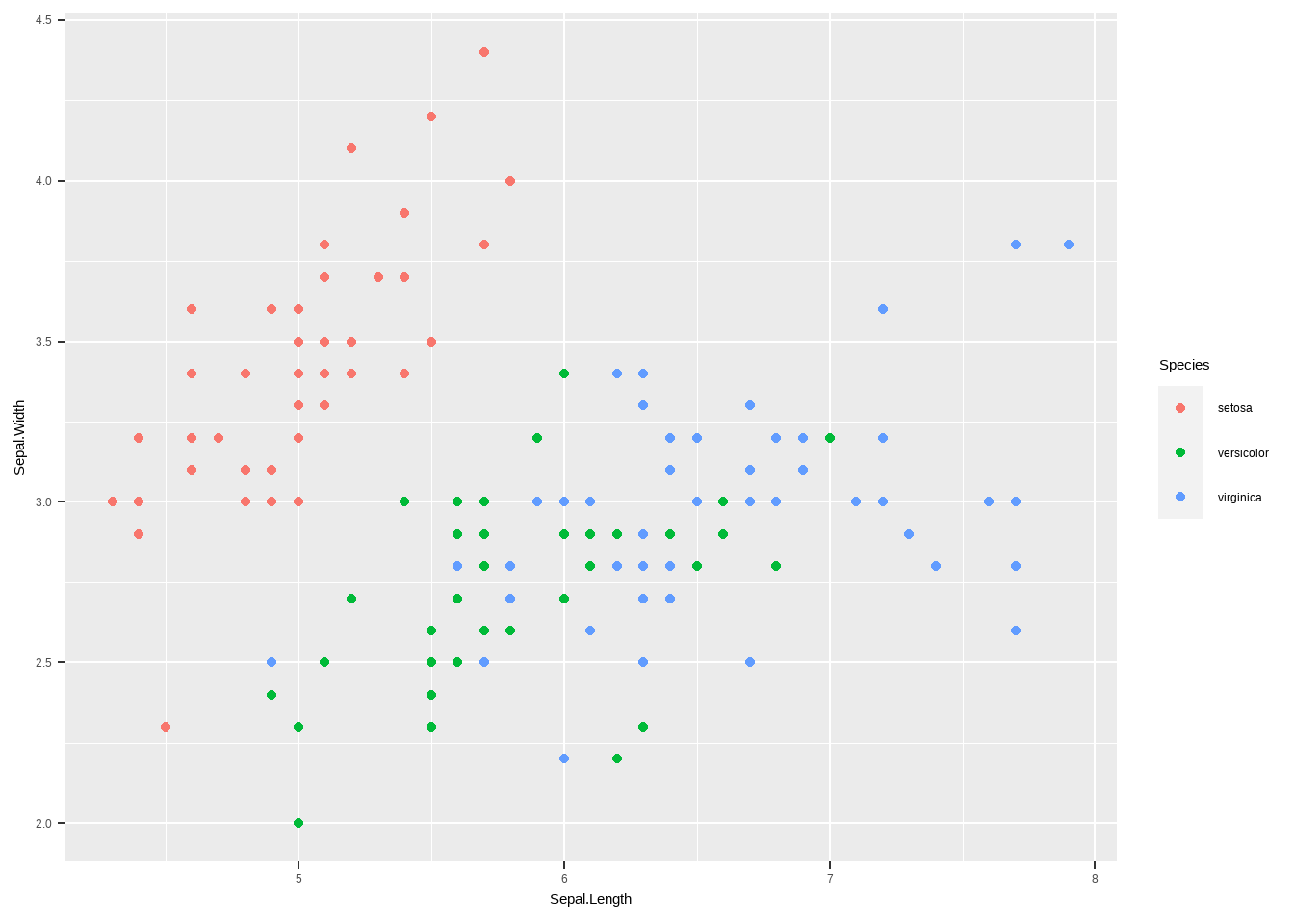
library(plotly)
ggplotly(iris %>%
  ggplot(aes(x=Sepal.Length,y=Sepal.Width,color=Species)) +
geom_point())library(survival)
library(survminer)
fit <- survfit(Surv(time, status) ~ sex, data = lung)
p <- ggsurvplot(
fit, # survfit object with calculated statistics.
data = lung, # data used to fit survival curves.
risk.table = FALSE, # show risk table.
pval = FALSE, # show p-value of log-rank test.
censor=FALSE,
conf.int = TRUE, # show confidence intervals for
# point estimates of survival curves.
xlim = c(0,1000), # present narrower X axis, but not affect
# survival estimates.
xlab = "Time in days", # customize X axis label.
break.time.by = 100, # break X axis in time intervals by 500.
ggtheme = theme_light(), # customize plot and risk table with a theme.
)
ggplotly(p$plot)